
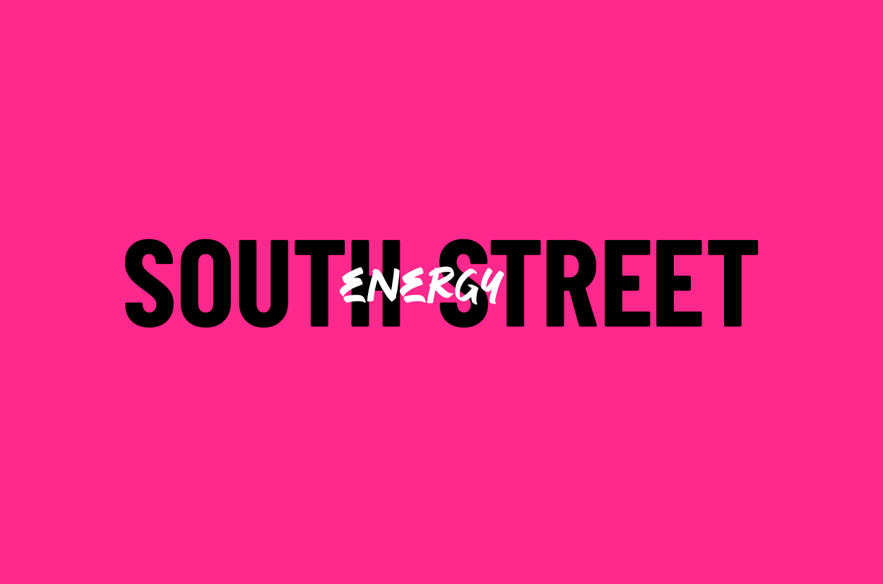
The dynamic layered logomark,created from ideas around amplifying, expanding & unlocking energy
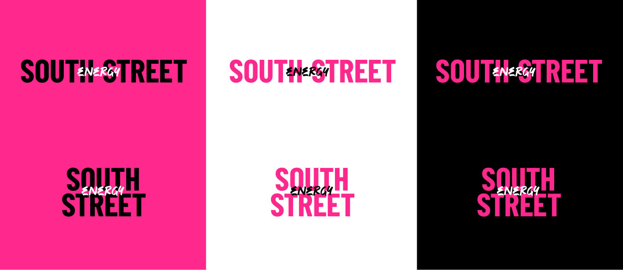
Logomark positive and reverse variations, horizontal and vertical variations

hero bright bold pink, supported by neutrals

SSE's love of street art in the local area (used in their exiasting portraits) informed the branding imagery and spraypaint style graphics
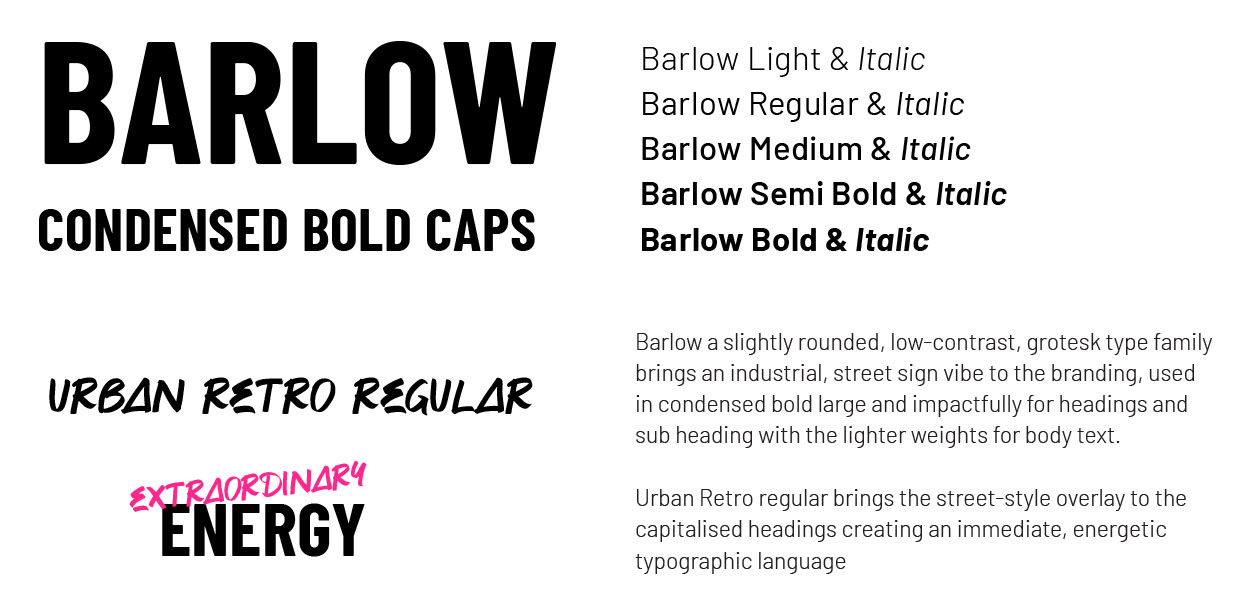
Industrial, street sign font pairs with overlaid handwritten 'street tag style' type
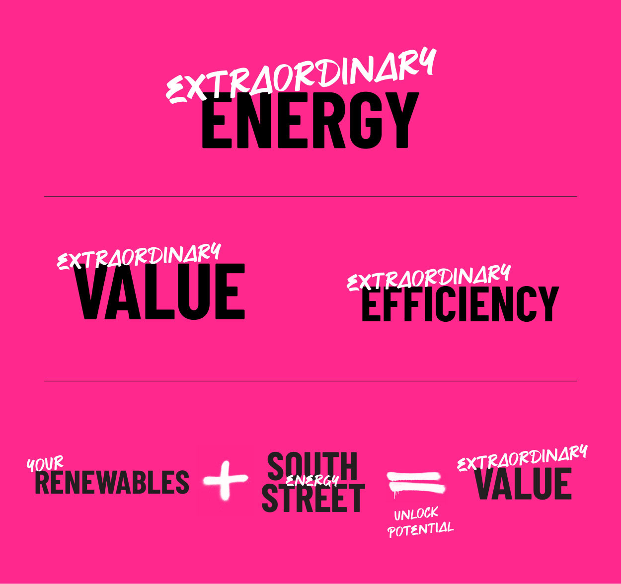
Hero messages stem from the brand strategy around 'Extraordinary Energy'
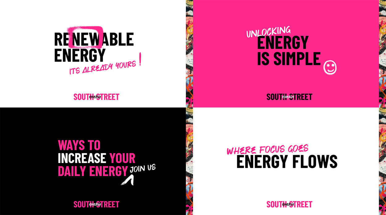
Key message type graphics
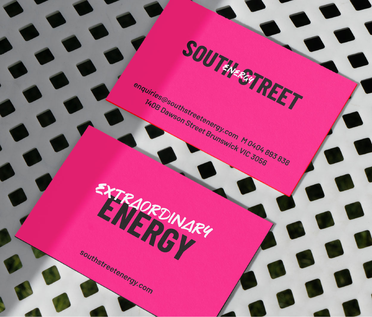
The hero pink is used on both sides of the card for impact
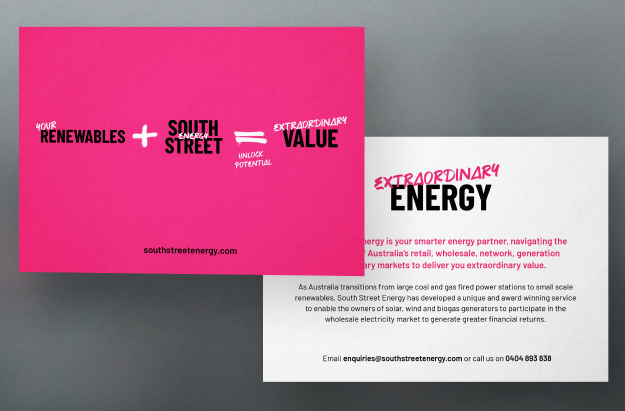
Promotional postcard for conferences
Email gif banner simply shows the energy amplifying logo
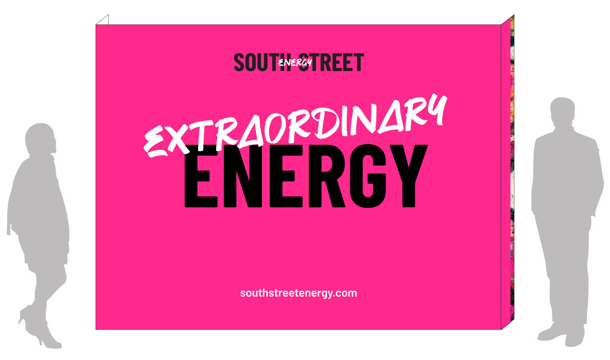
Design concept for large conference banner
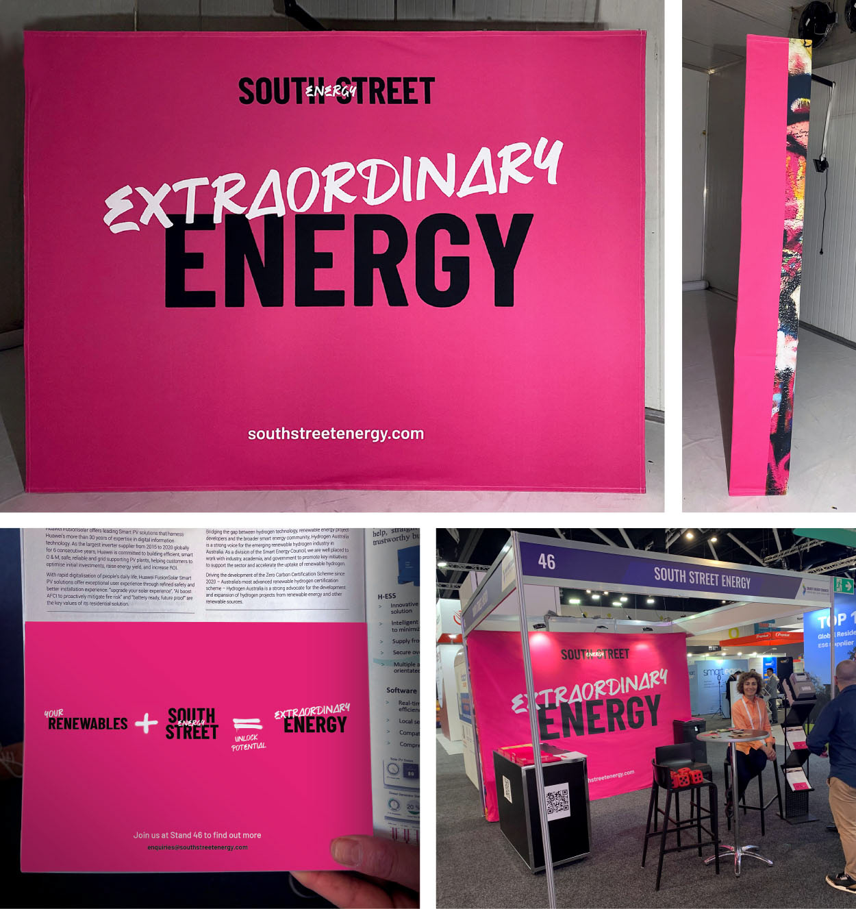
In a cluttered conference environment keeping the large banner and ad simple and bold created the most impact

PPT template uses the branding to full effect