The hero Q symbol with an idea behind it – clever communications
The Q symbol and wordmark, for use where the full name is needed
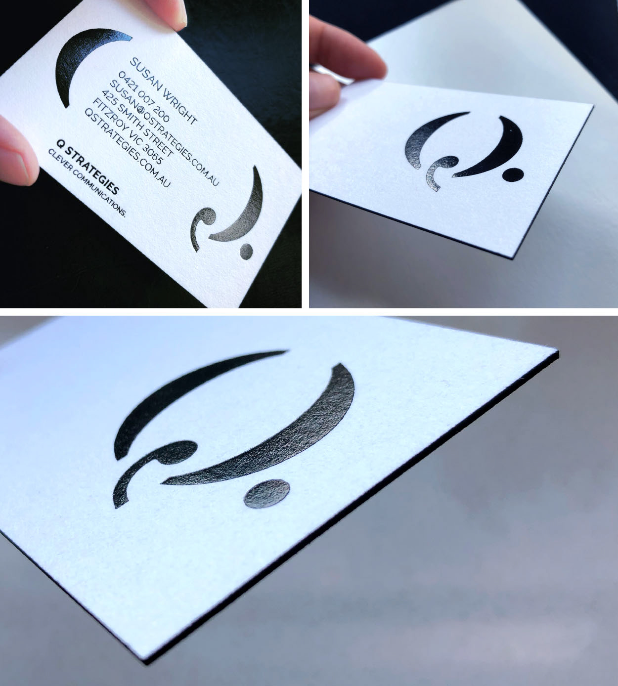
Q stationery 2.0! Beautiful thick card with a premium black edge, gloss ink on the Q symbol
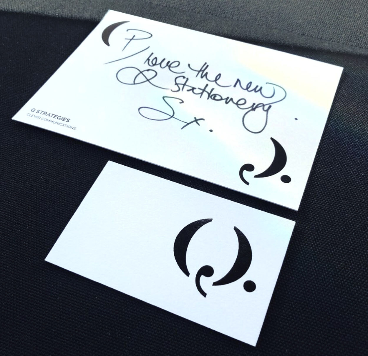
The Q symbol is able to be expanded to create 'brackets' in which to insert a hand written note on a postcard or contact details on the business card
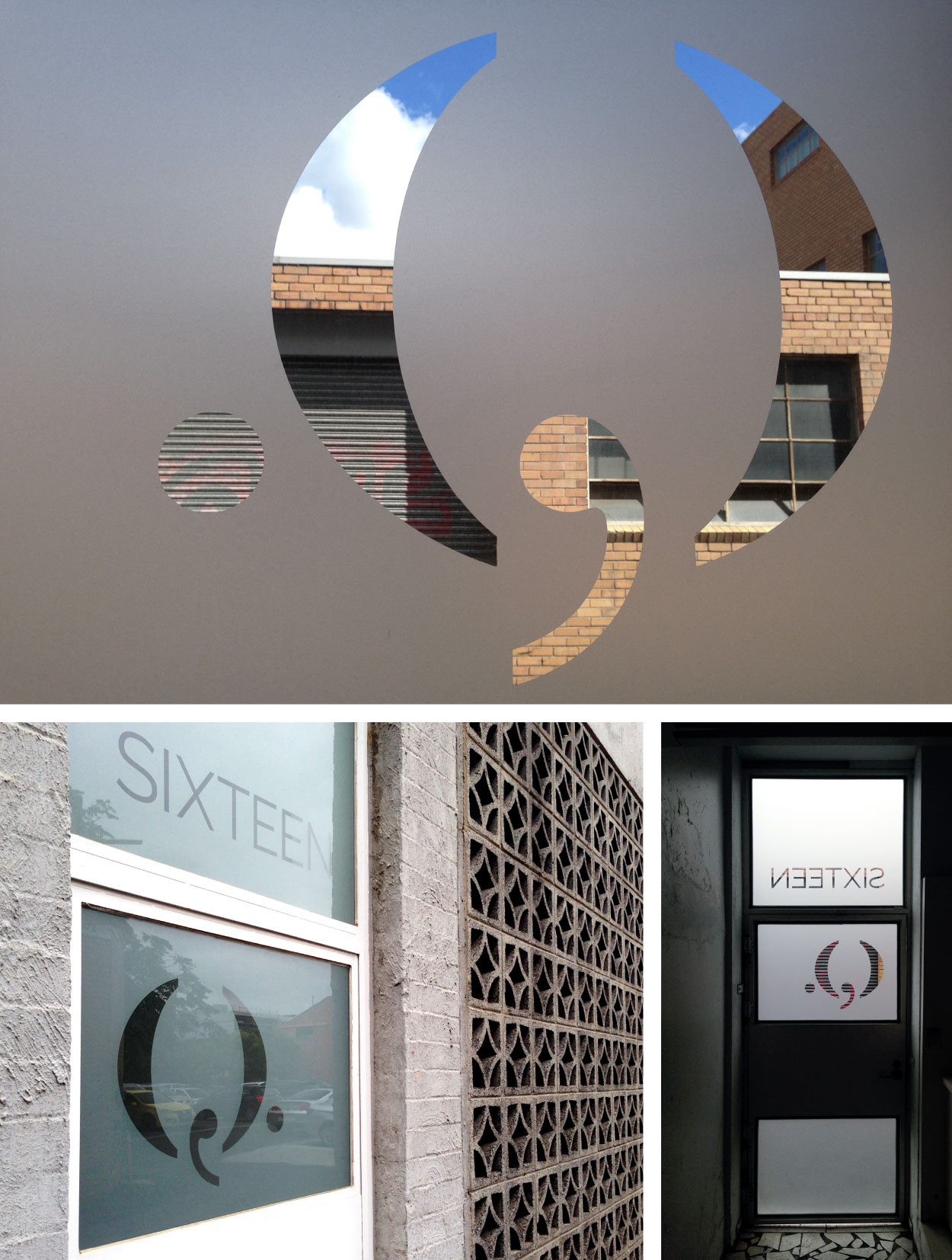
Simple but effective decals on the Q studio door
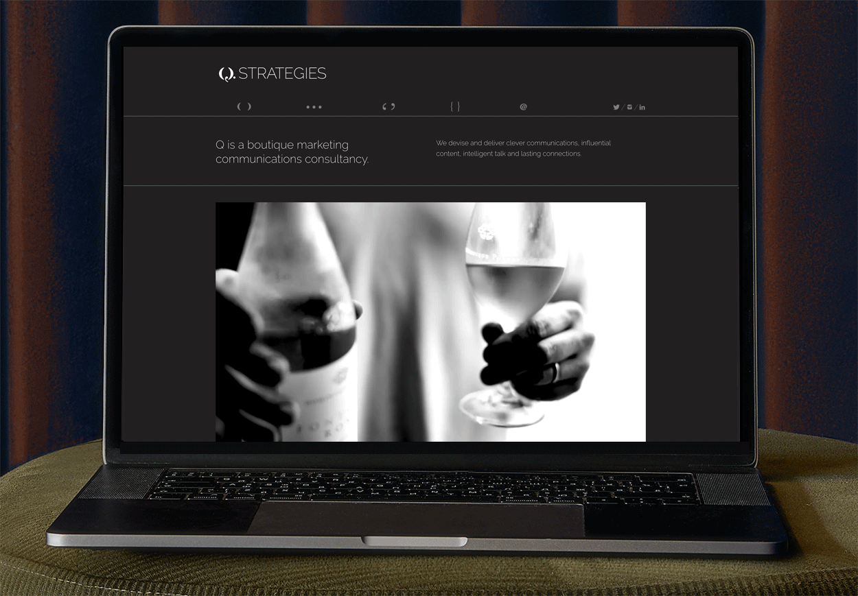
Q website 2.0. The original design with its playful punctuation both in the navigation and as large pullouts stayed unchanged and was given a development upgrade by Adrian Karnowski. Visit the website here
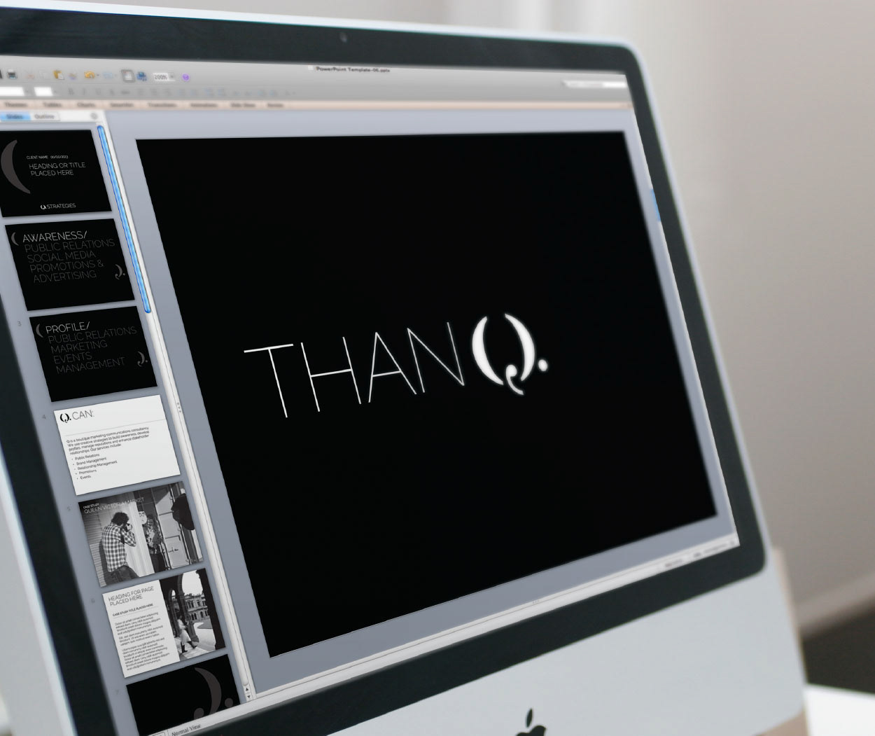
Details matter when presenting to clients, so a beautiful ppt template was designed with the minimalistic brand identity in mind
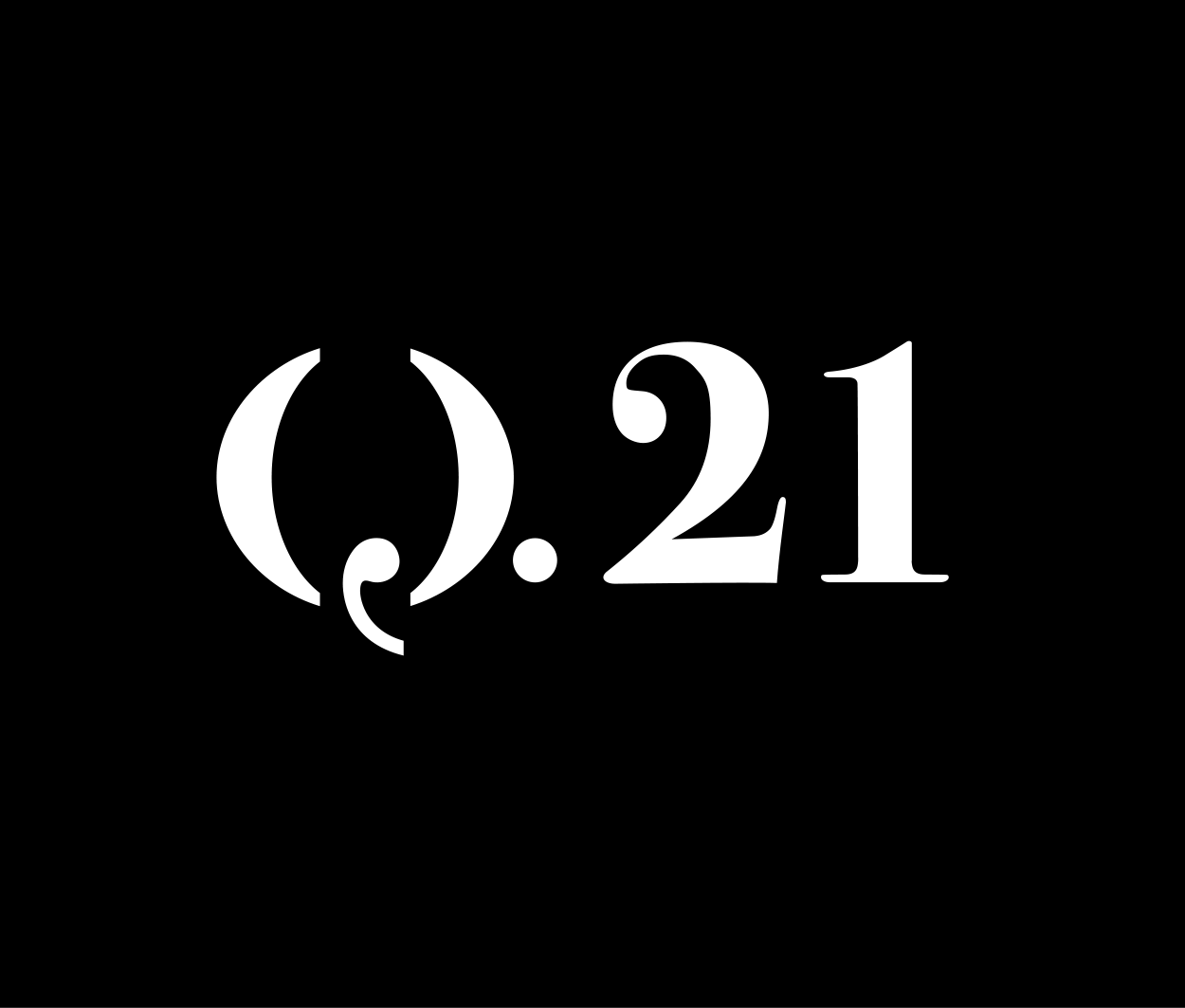
The 21-year anniversary of Q Strategies celebrated with a typographic mark and some fun typographic play with 21 Q's!
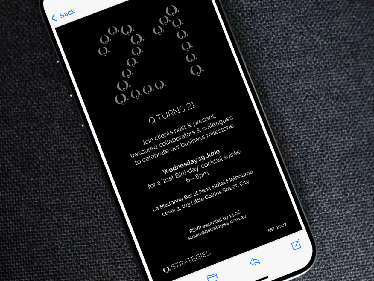
Q is 21 graphics for the celebration event. Applications included E-invite, menu and the mark was also used by the Yarra Valley Chocolaterie to create some take home chocolates!
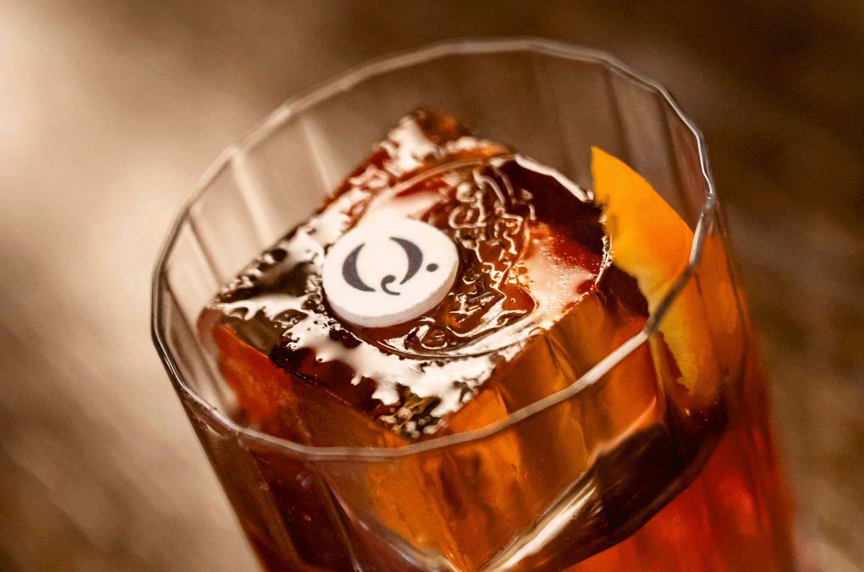
Q Strategies collaborated with The Next Hotel's restaurant La Madonna to create some fabulous food and drinks branded with the the Q
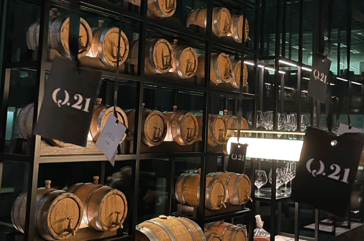
Balloons with hanging tags of Q's past and present clients in the barrel room at the event. Event concept by Q Strategies, tag design by Pauline Mosley
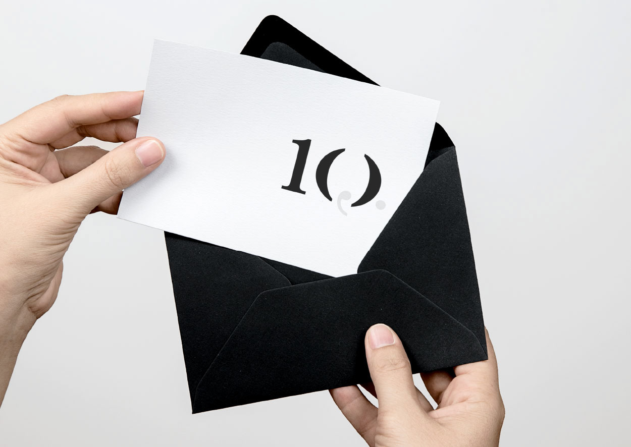
10 year anniversary of Q Strategies typography for a lovely handwritten card to clients