neighbo / brand identity for an online search engine, launching soon! More visuals to come
Chutts / a sunglasses brand inspired by the radical, independent, effortless style of countercultures past and present
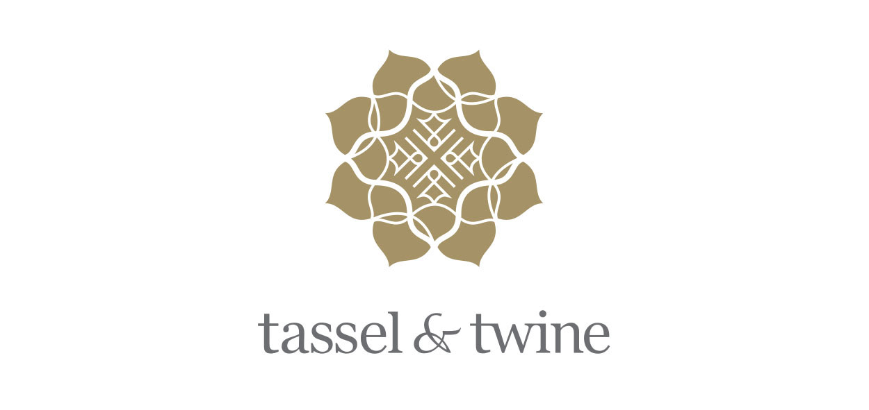
Tassel & Twine / a sustainable homewares brand with products made and designed with artisans in India. The brand symbol uses a the idea of a traditional mandala with the core principles of the brand incorporated - handcrafted, collaboration & helping communities. View the full case study here
Happy Healthy Fitness (hhf) / logo for a Melbourne-based women's activewear brand targeting the 'mid-life' women
Beauty Bliss / a new brand to reflect its positioning as a specialised skin boutique. The typographic BB butterfly is symbolic of the transformation to beautiful skin. Full case study here
TheLearnery / a modern take on an in-person classroom, offering affordable short courses and workshops in doing, creating, learning and being
Zjoosh Your Socials / the social media training arm and facebook group by Reddendale Media, helping 'Zjooshers' join the dots with their social media to 'Get out of the weeds and start getting leads'.
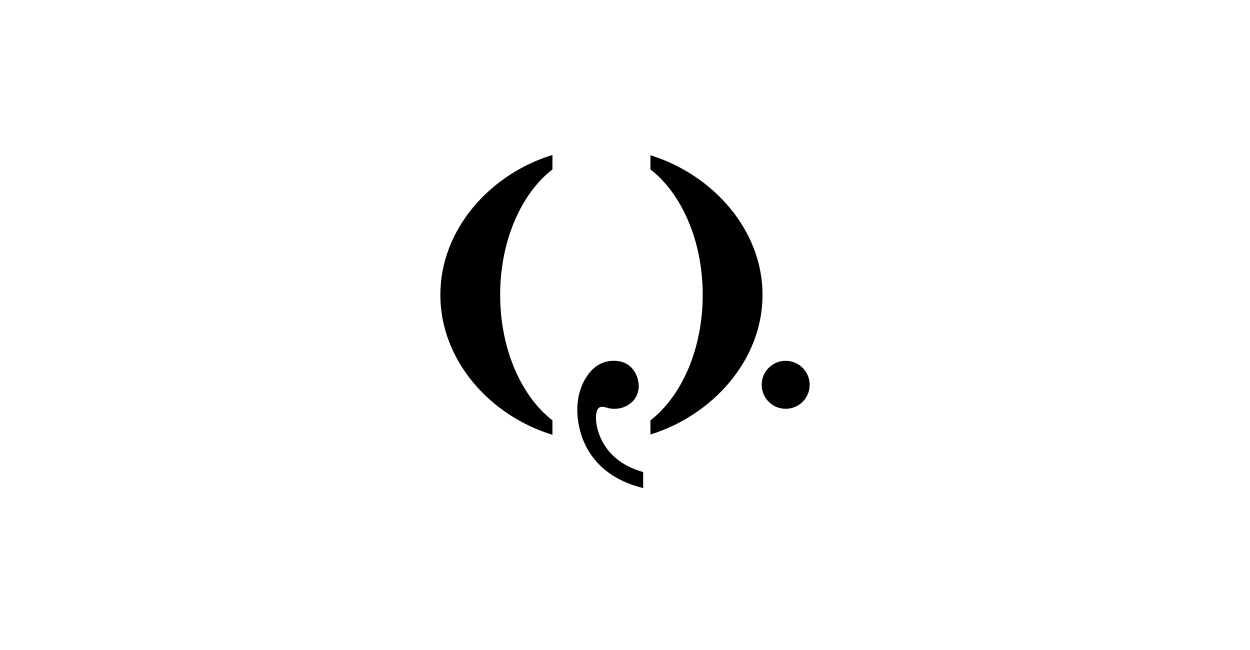
Q Strategies / a boutique marketing communications consultancy. The idea was based on the knowledge that the consultancy’s work gets people talking. View the full case study here
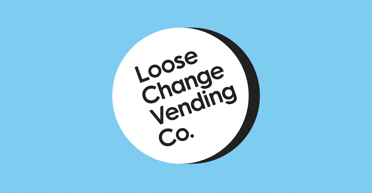
Loose Change Vending Co / reliable, quality vending machines, service promise and convenient offer were forefront to the visually and tonally friendly brand identity.
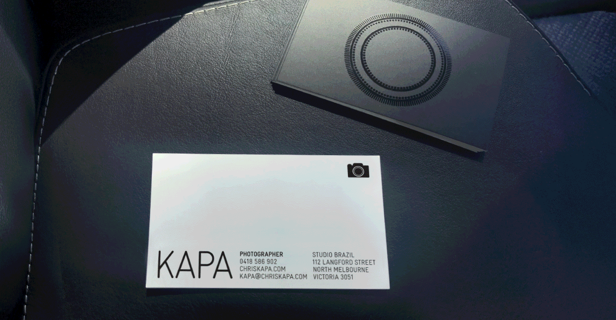
KAPA / identity, promotion piece series and website for the enigmatic photographer. Gloss varnish was used on printed items for a textural effect on the lens graphics

Robotic Assist / the typographic monogram 'ra' uses a stylised robot arm and arrow symbolising the name perfectly
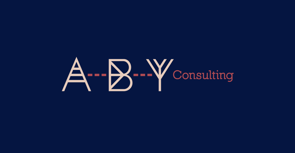
ABY Consulting / brand identity and graphic environment for a strategic planning business. Driven by the hero brand idea ‘from A to B & why’ process lines and bespoke letters traverse each application.
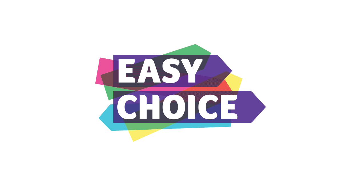
Easy Choice / new name and identity for an existing business who help thousands of Australians save on their energy, phone & internet bills
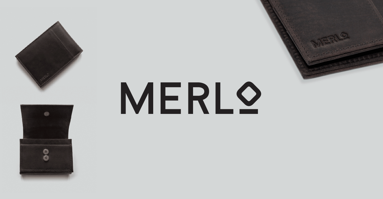
Merlo / logo for a stylish British-designed wallet range. The wallets are paired with cutting edge technology inside for use with contactless card payments. The 'O' gives a graphic impression of the wallet & a scanner.
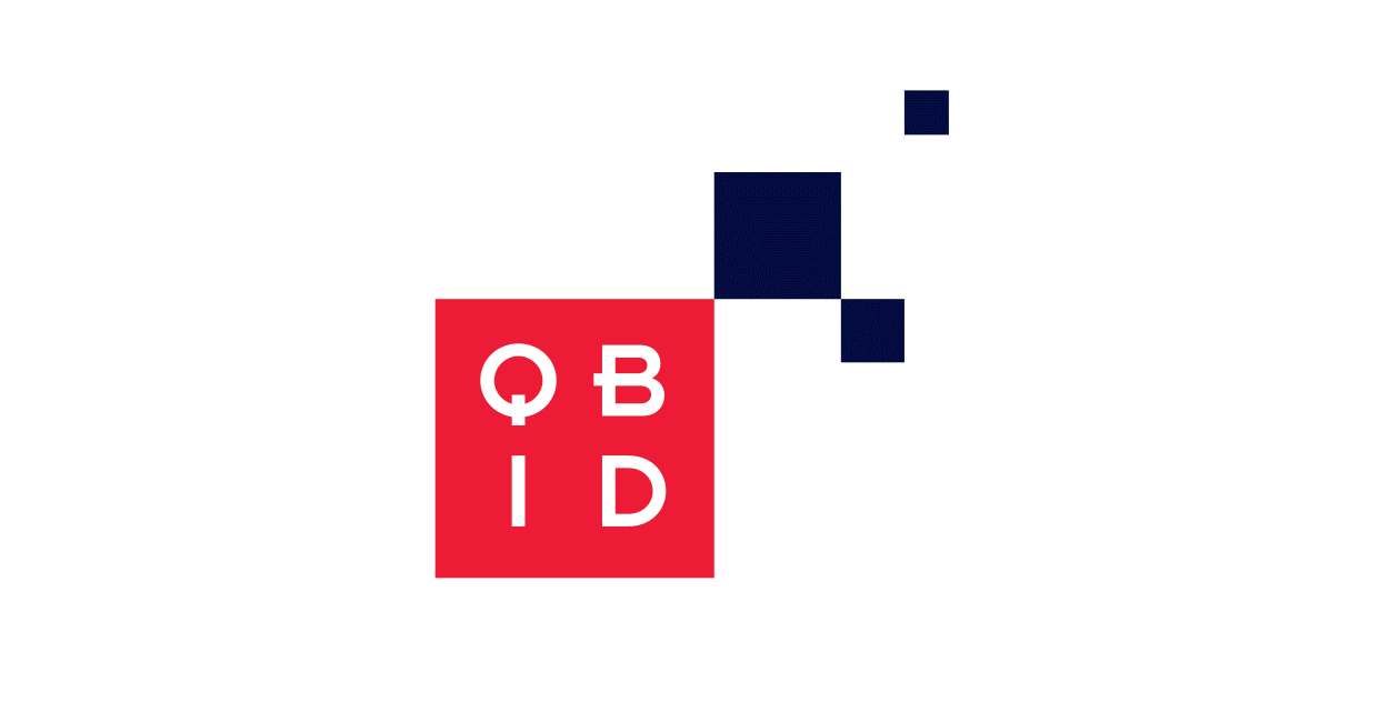
QBID (Quality Brands International Direct) / building Australian brands via e-commerce in fast-growing foreign speaking international markets such as China
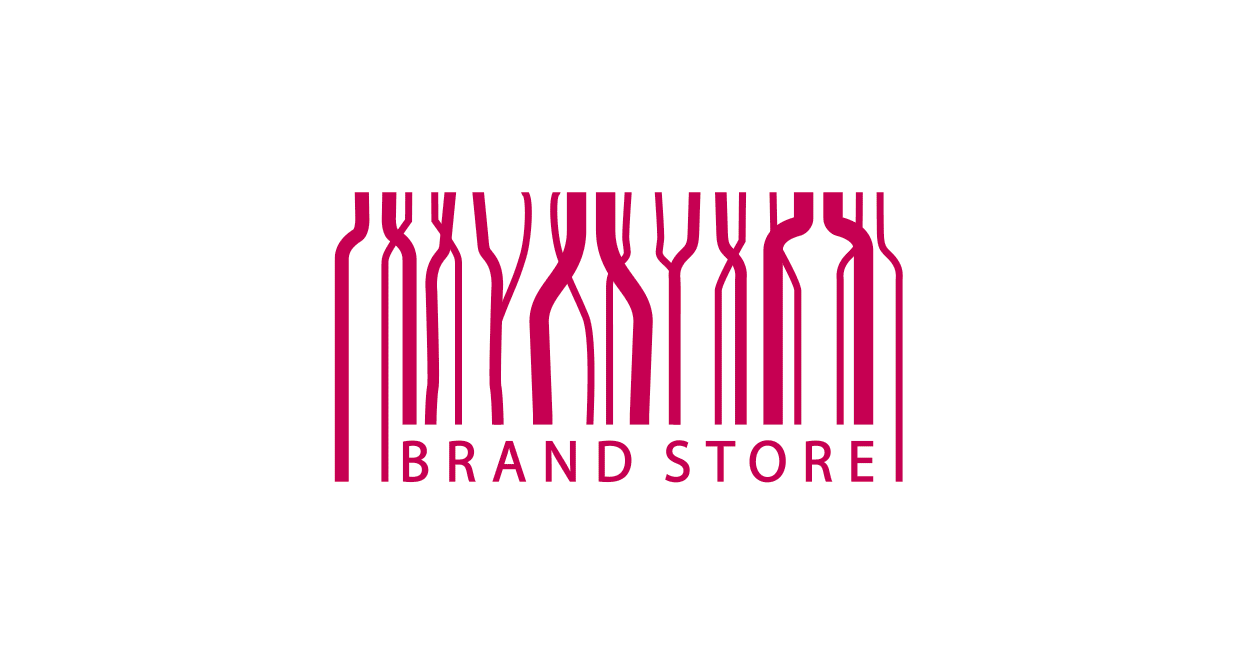
Diageo Brandstore / the internal staff shop at Diageo HQ provides an opportunity to showcase products to staff. Completed while working at Ellipsis.
Nixon Tulloch Fortey / three architects in one company. Completed while working at Hayman Design.
Flipit / the first folding chair in the world you can open or close instantly with one movement using one hand. Completed while working at Direct Design.
The Good News / news you actually want to hear, logo by Pauline Mosley and a platform brought to you by the good folks at Enthral
52 Collins Street Melbourne (Australia) / the logo graphically represents the architect’s modern vision for the newly renovated foyer. Completed while working at R-Co.
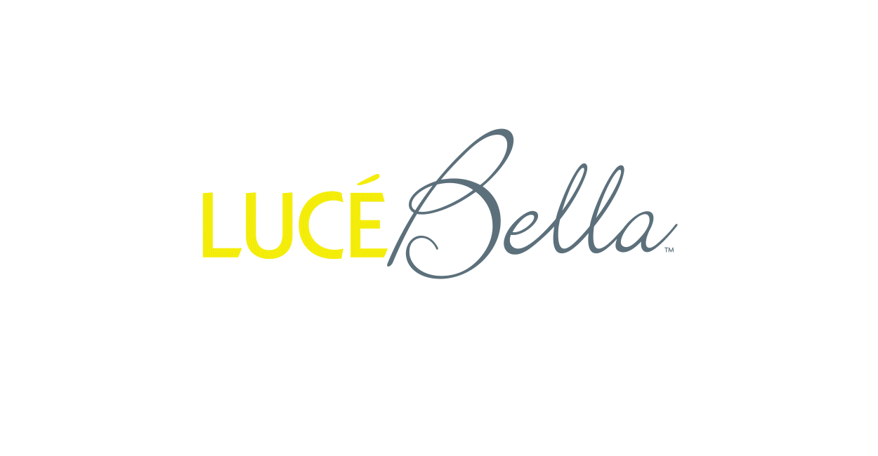
Lucé Bella / a European feel for an in-house lighting range which means ‘beautiful light’ in Italian. Completed while working at R-Co.
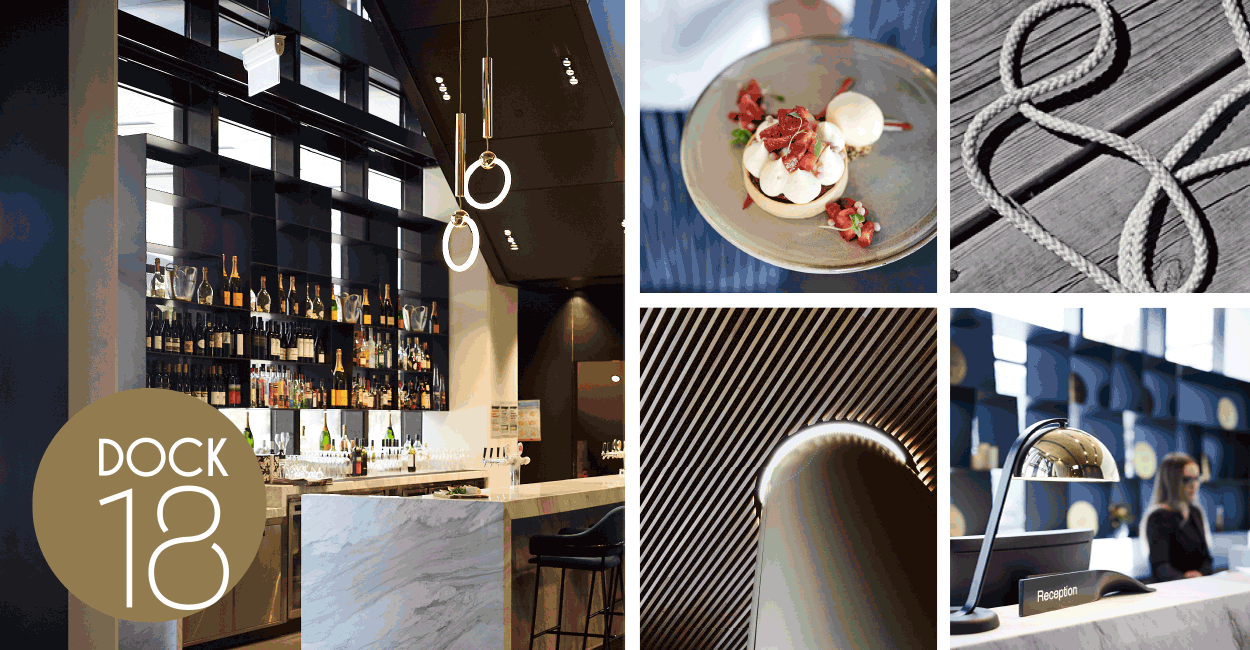
DOCK18 / taking inspiration from the Docklands setting on the marina and circular interior details, a logo was created with a nautical feel for the restaurant at The Four Points Hotel by Sheraton
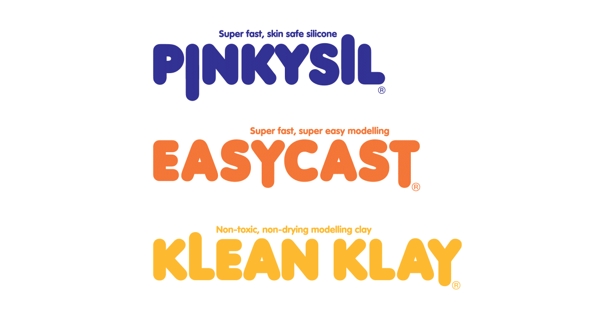
Barnes packaging identities / sculpt it, cast it, mould it, finish it – a range of graphic logotypes for a supplier of materials for jewellery, model making and creative projects
Christie Executive/ a fine stylised ‘ce’ monogram conveys the idea of connection for this C-suite recruiter
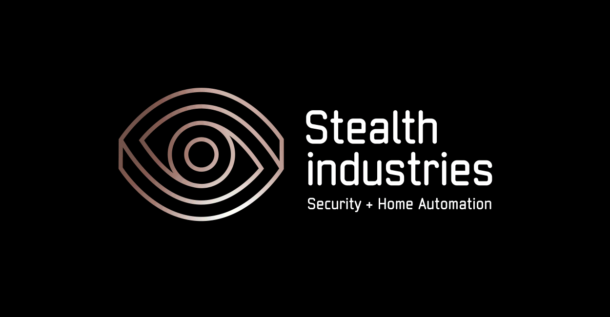
Stealth Industries / a brand identity and name to appeal to savvy high-end customers seeking security and automation installed in their home or commercial property. A clever optical illusion creates impossible perspective and depth alluding that security is watching from the centre of the ‘camera’ eye.
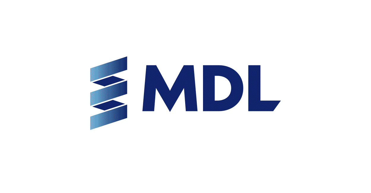
MDL (Mineral Deposits Ltd) / a mineral sands mining company. The brand symbol was a natural progression after teasing out their 3-year strategy MINE > INTEGRATE > TRANSFORM. It visually shows the integration of their Senegalese & Norwegian assets and is a nod to the processes involved in filtering the minerals from the sand.
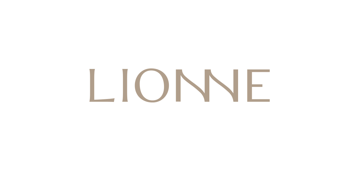
Lionne / meaning 'female lion' in french this brand identity reflects the nature of the consultant who specialises in commercialising resource projects.