
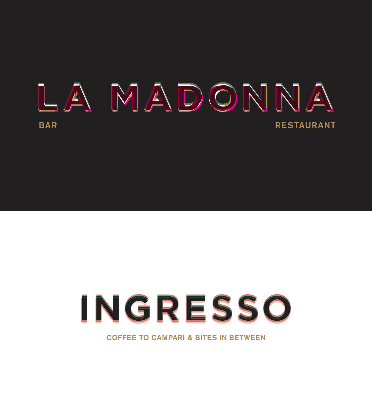
A family of logotypes connect the f&b offer for Next Hotel, each with its own look
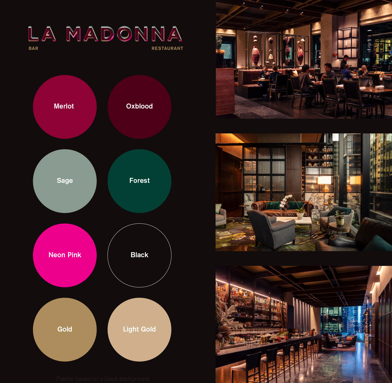
The colour palette is reflective of the interior colours of La Madonna Restaurant & Bar – warm tones in the ceramics, leather banquettes, carpets and gold touches. A riff on the chef duo's food fusion– Italian red, white and green – switching it up with some neon Shanghai pink
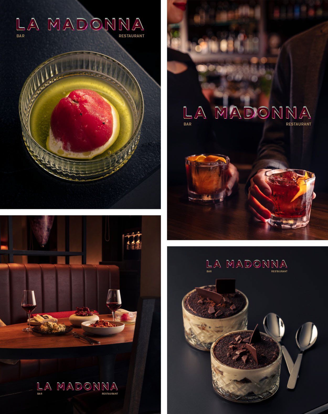
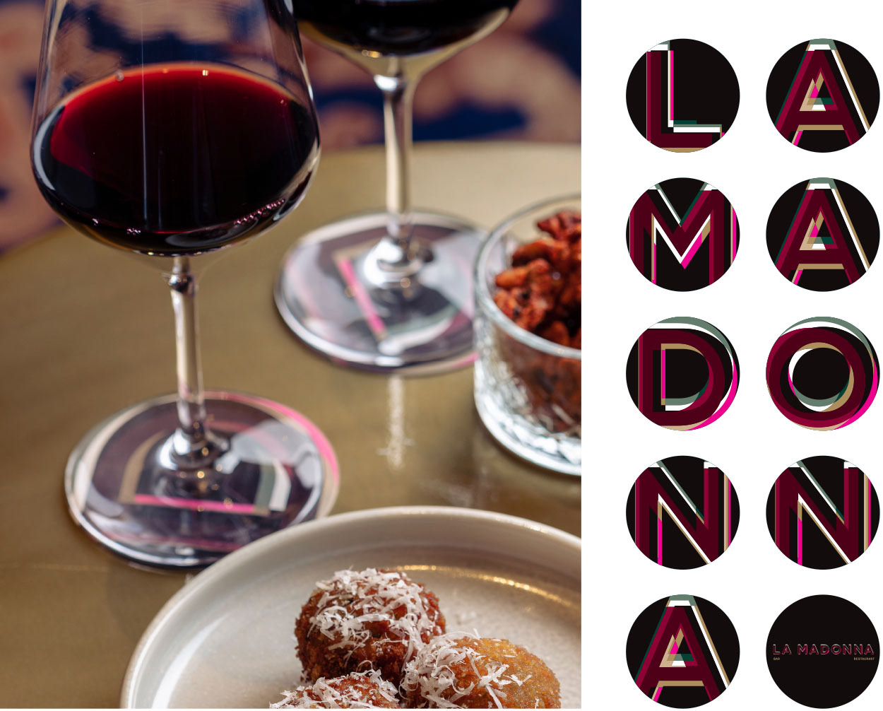
Imagery and graphics marry perfectly with the logotype applied over ‘moody’ food & drink photography by Greg Elms, Art Direction by Q Strategies
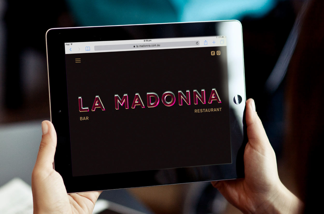
An unexpected web application with the logotype filling the screen as the feature. Initial concepts were to have the logotype animate where the pieces come together and 'glowed'. A moody black background website sets the tone for the experience.
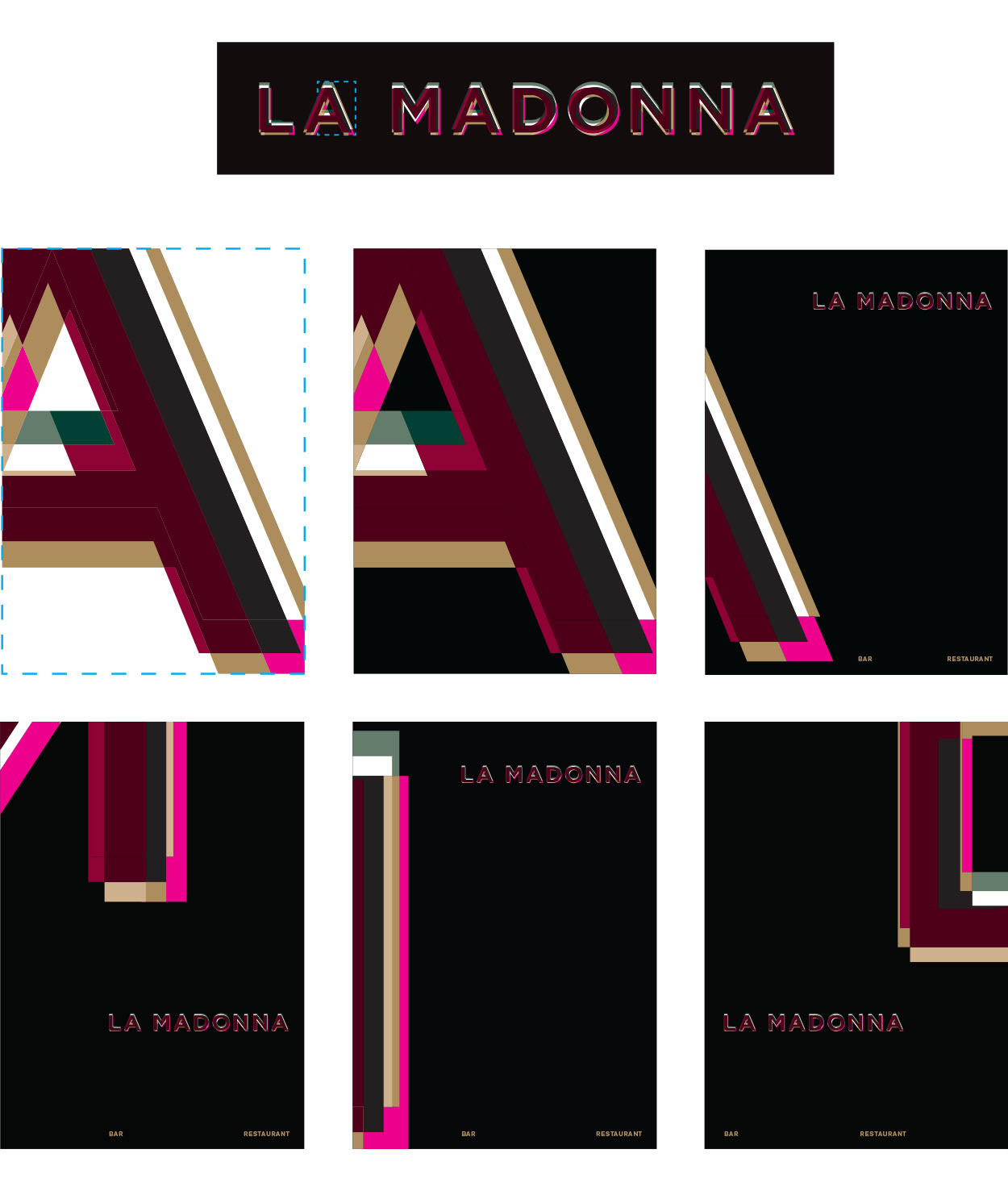
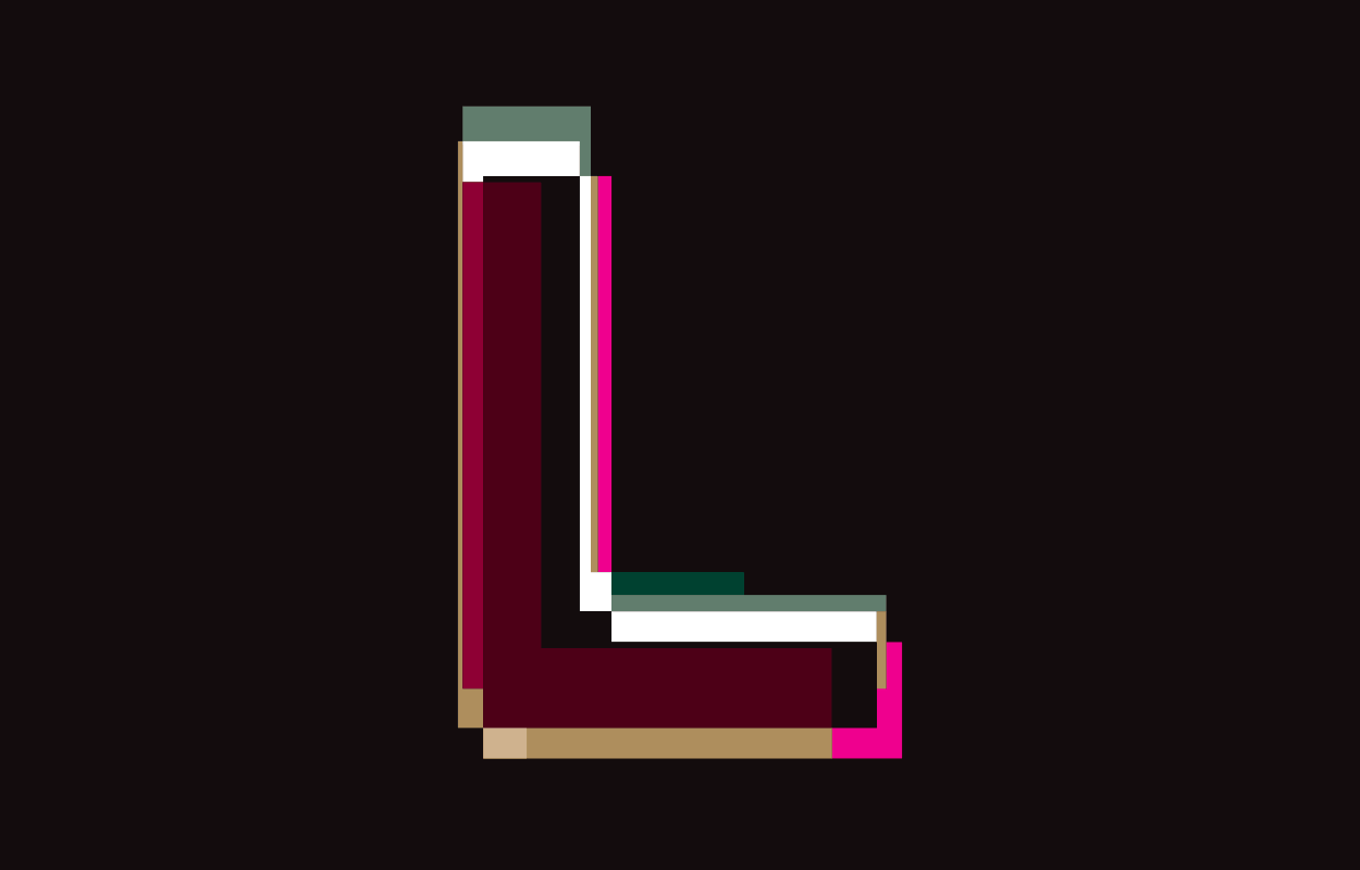
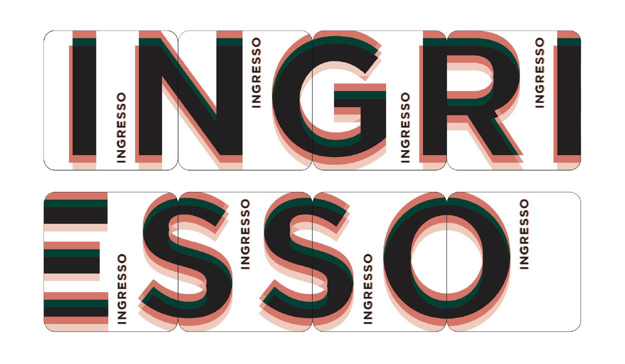
The ’type’ can be moved, enlarged, and cropped to create an interesting pattern play that’s curious and dynamic
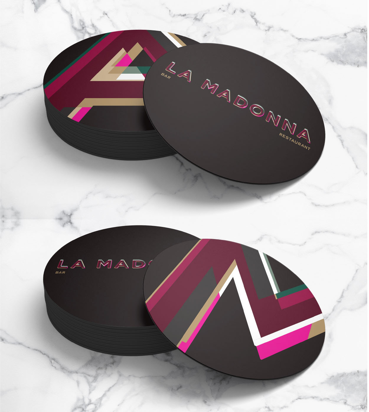
Dynamic sections of cropped letters from the logotype are added to coasters with the logo on the reverse
Coasters add a touch of La Madonna branding to the table

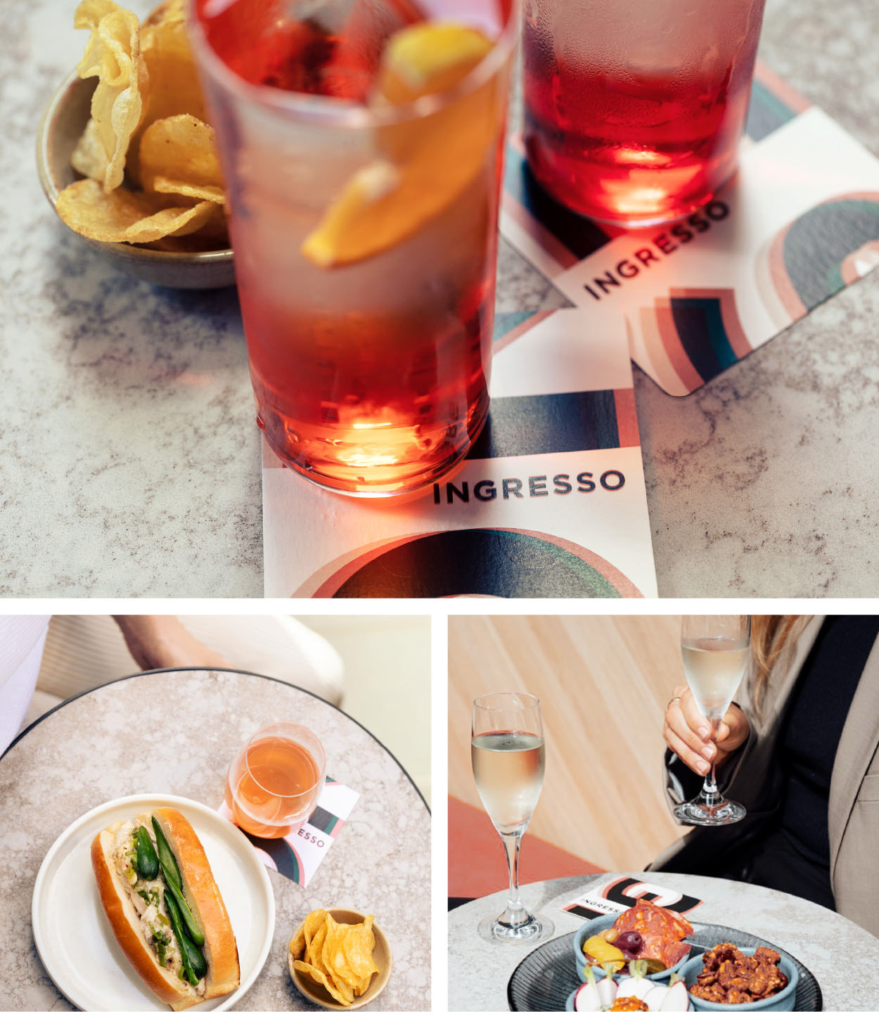
Mixing up letter crops and the moody style photography for social media. Socials strategy & content Q Strategies, photography Greg Elms
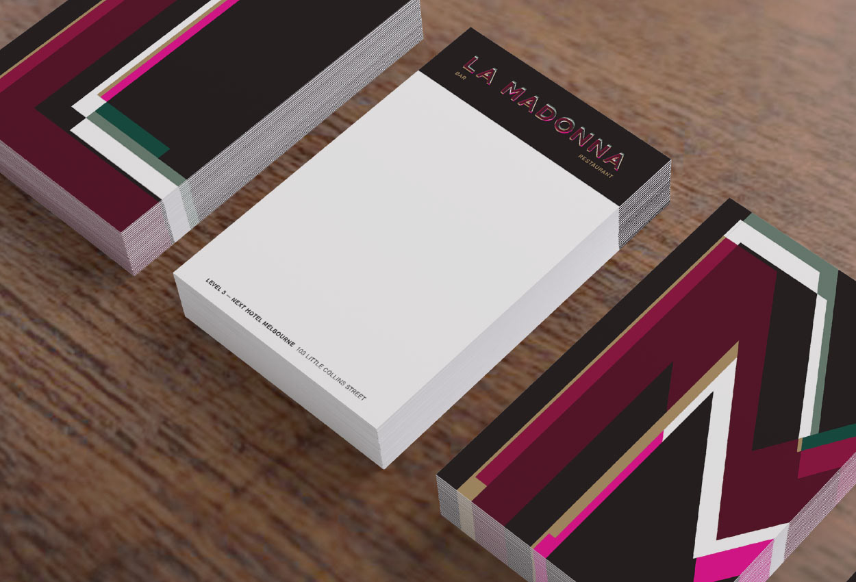
Note cards and business cards combined in an A6 format — for guest to take, to make notes about a favourite drink, details for later, to accompany the bill...
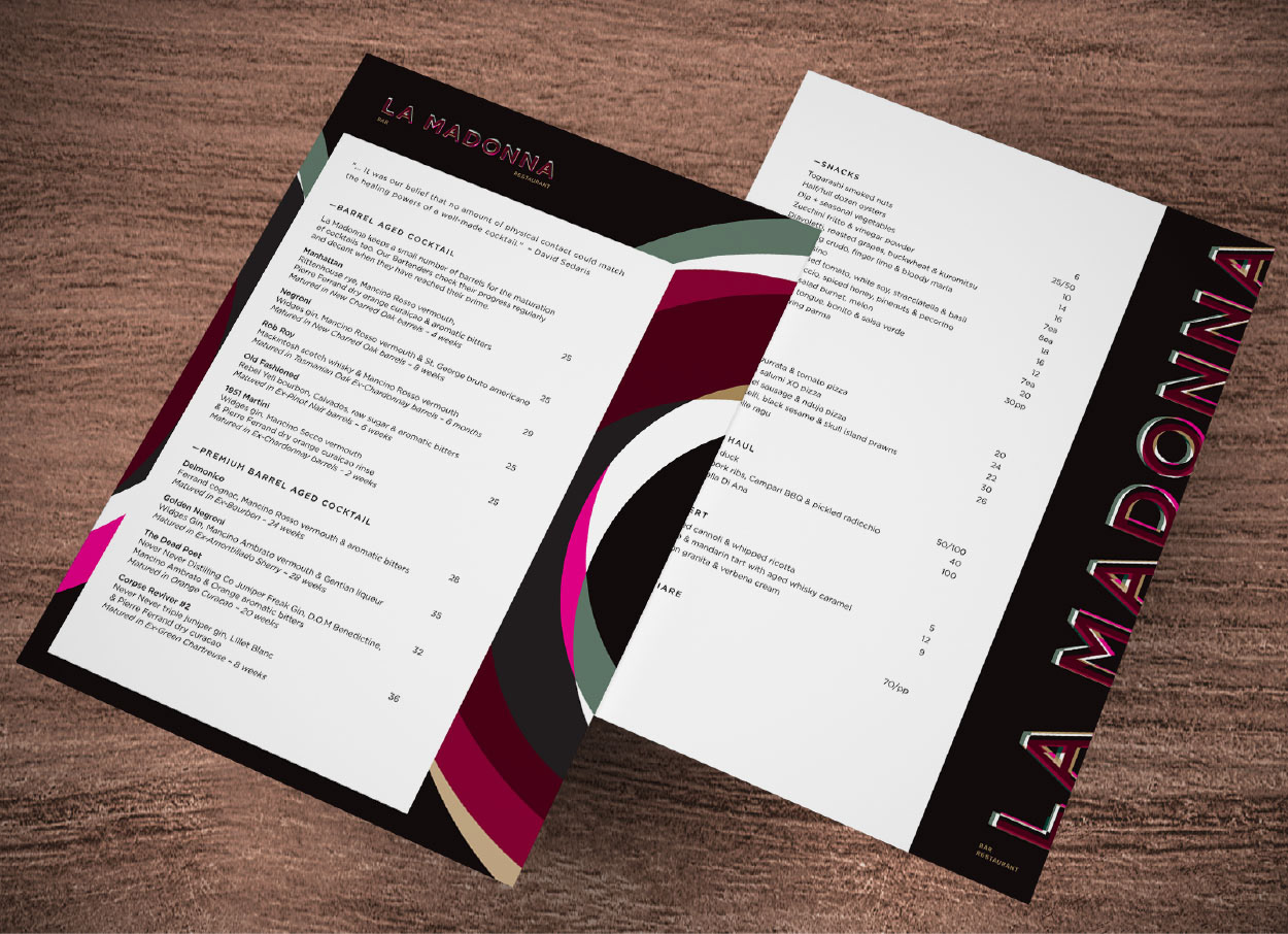
Two styles of menus for drinks and food were preprinted and then templates provided for daily / seasonal updates
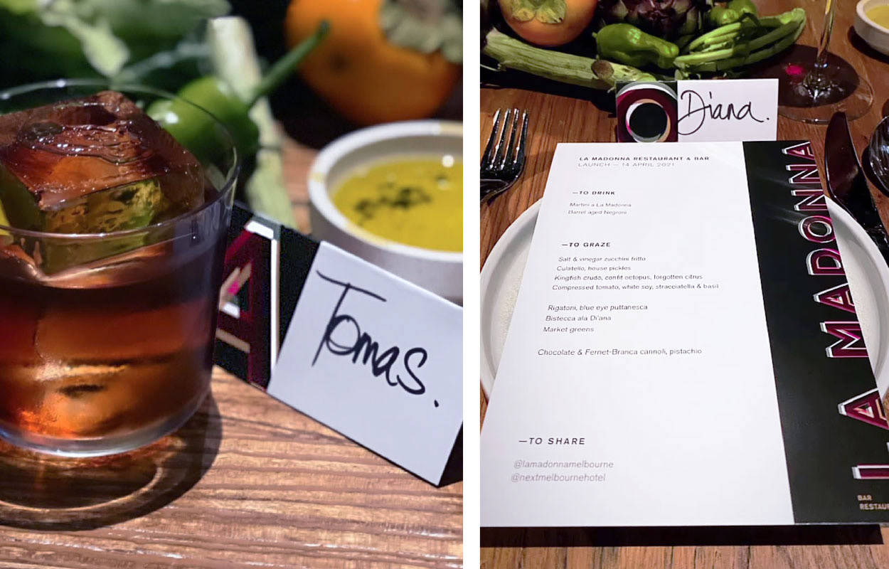
Table placeholders and menus for the La Madonna launch event by Q Strategies
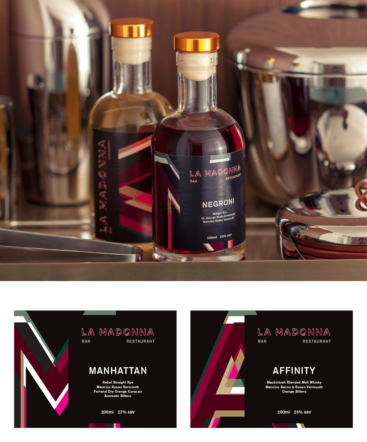
Labels for the 'single glass' barrel aged cocktails available in the room suites. The cropped letter chosen relates to the cocktail name
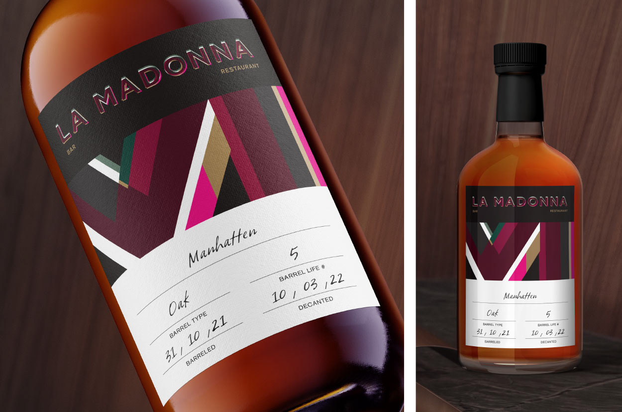
Pre printed bottle labels for limited edition barrel aged cocktails, space is left to add handwritten details about the process
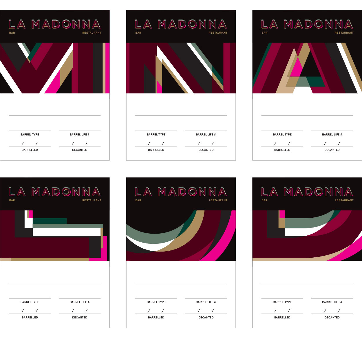
Different letters options eg N for Negroni, M for Manhattan, When there is no initial available from the logo a middle letter would be used.
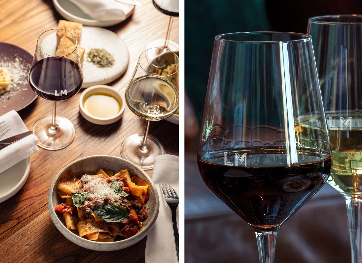
'LM' initials created to work for etched wine glasses
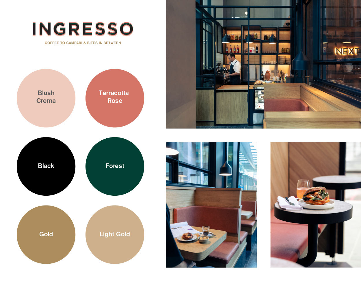
A brighter toned colour palette of the interior – but also of coffee creme, the blush of a prosecco and another twist on the Italian colours (red, white & green)
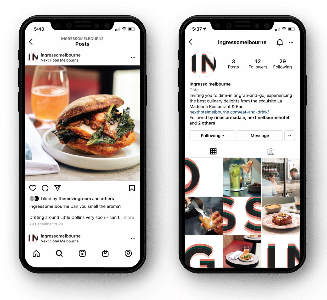
Mixing up letter crops and the light 'aperativo' style photography for Social Media. Socials strategy & content Q Strategies, photography Greg Elms
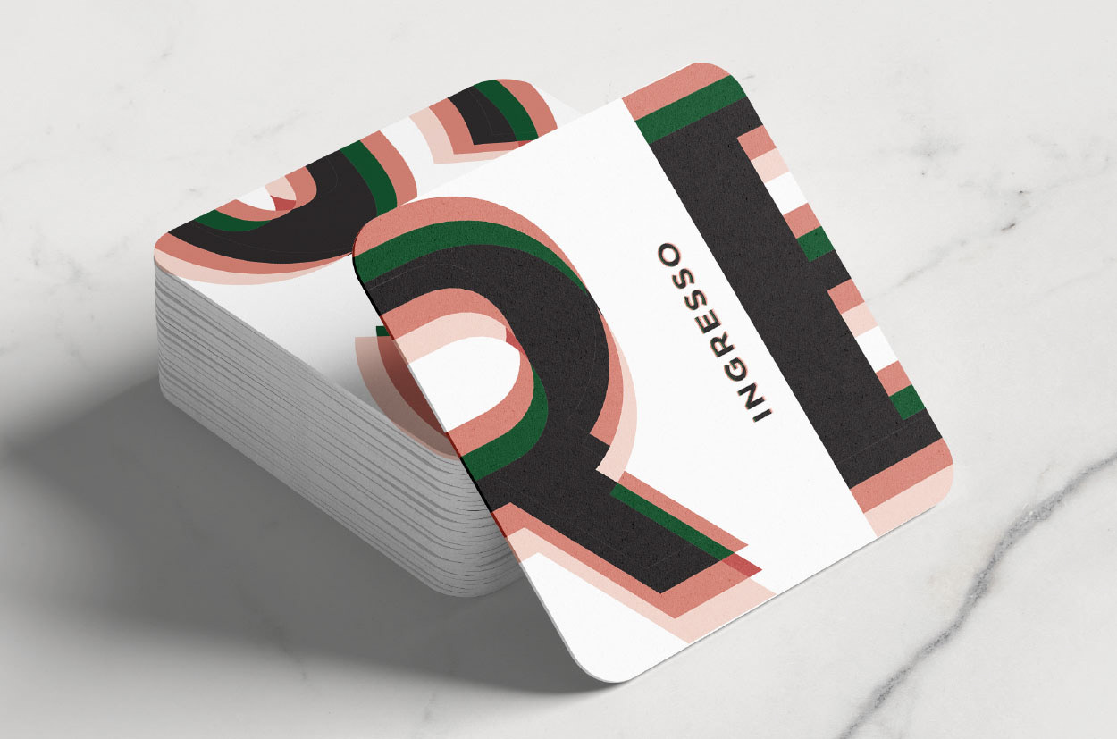
Crops of the logotype create dynamic looking rounded edge coasters
The logotype is divided up to create multiple coasters, when placed together they make up the logo and create a ‘bar game’

A large logotype wraps round the Biopak coffee cup, showing the colour layering within the type to full effect
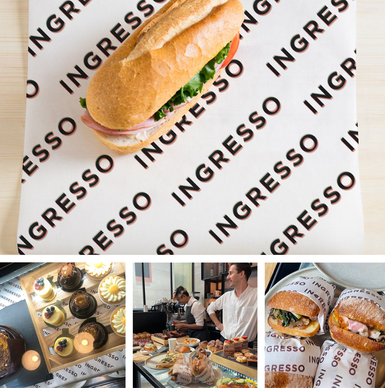
Repeated large logotype pattern for food grade tissue wrap
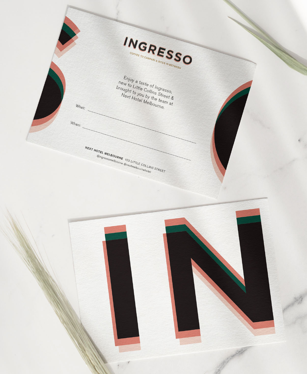
A5 gift card used to attract local business's to the cafe when it opened
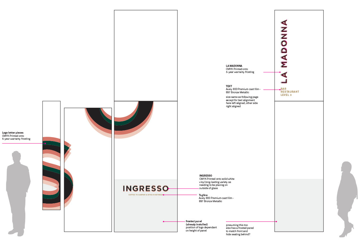
Front and side window signage design for Ingresso with upper window signage for La Madonna. Cut up ‘sections of the logo’ appear on the front window and door and also down the length of the side windows.
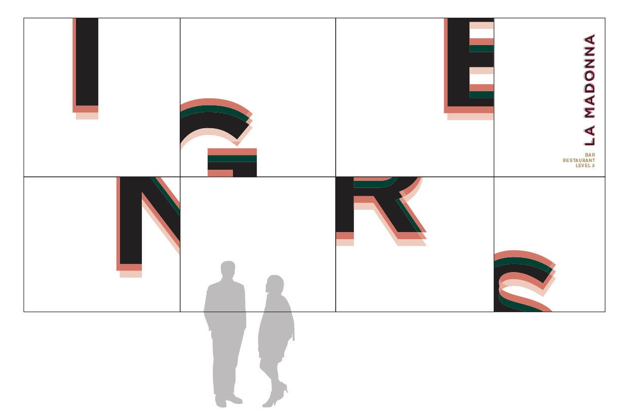
Laneway side window signage design is impactful, interesting, bold but tasteful and doesn't interrupt the view into the cafe
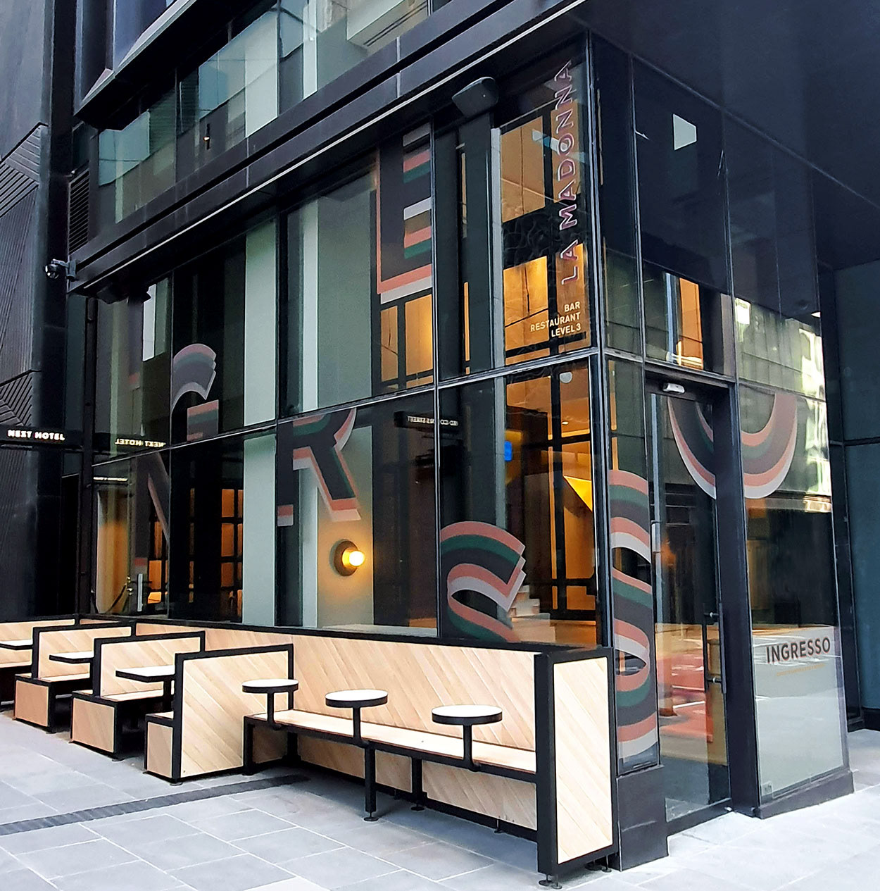
Laneway entrance to 80 Collins Street precinct window signage. Lighting from inside changes the design from day to night.Signage printing Anchor Signs
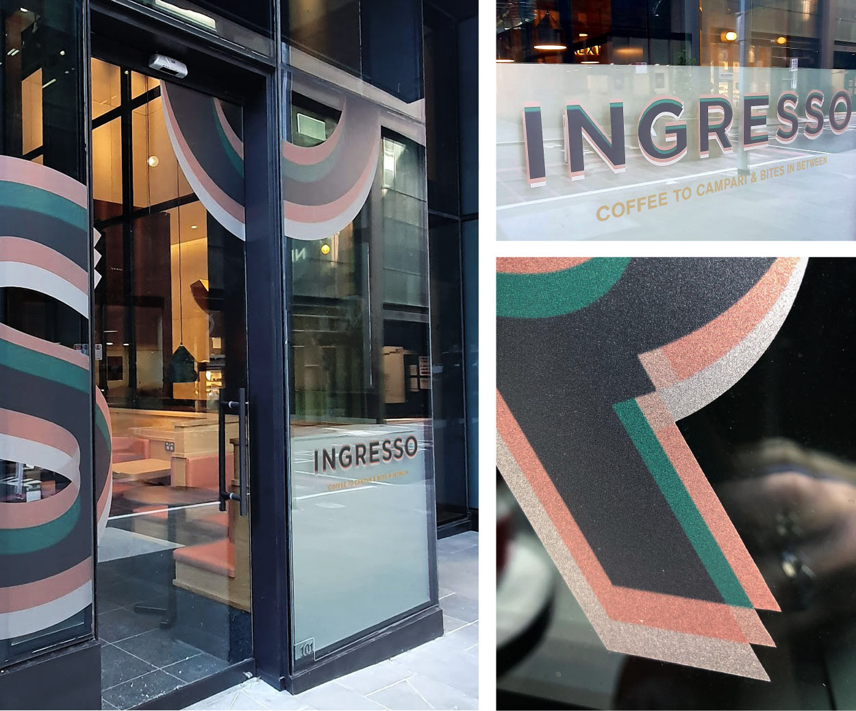
Signage details. Vinyl print on frosting gives a slightly metallic giving a premium look to the application. Signage printing Anchor Signs