
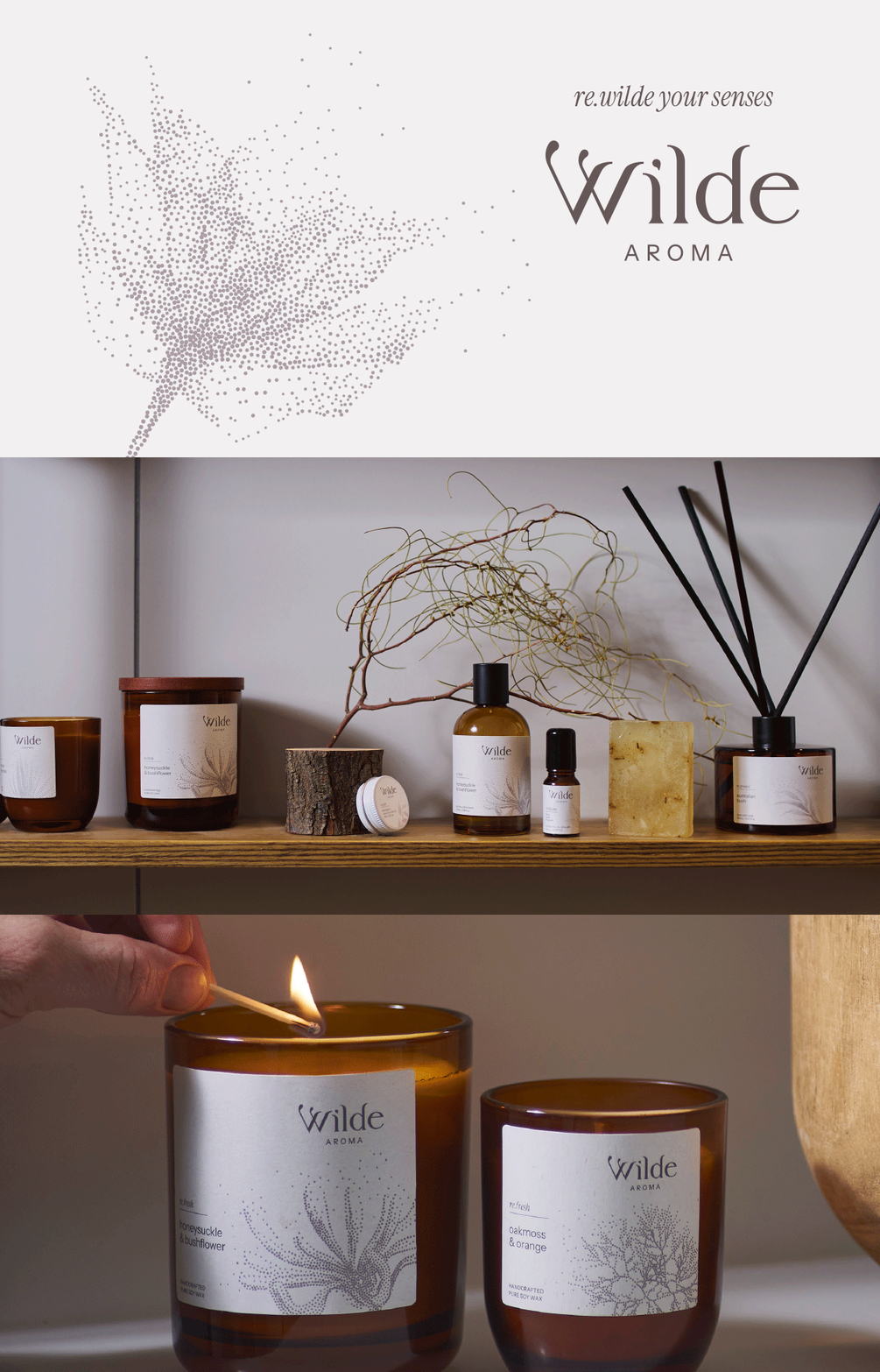
Wilde Aroma / brand strategy, visual identity and tactile packaging for a handmade range of candles and scented natural products, the tagline ‘re.wilde your senses’ led the way to a raw yet refined aesthetic. View the full case study here

Happy Healthy Fitness (hhf) / logo for a Melbourne-based women's activewear brand targeting the 'mid-life' women

Chutts / a sunglasses brand inspired by the radical, independent, effortless style of countercultures past and present
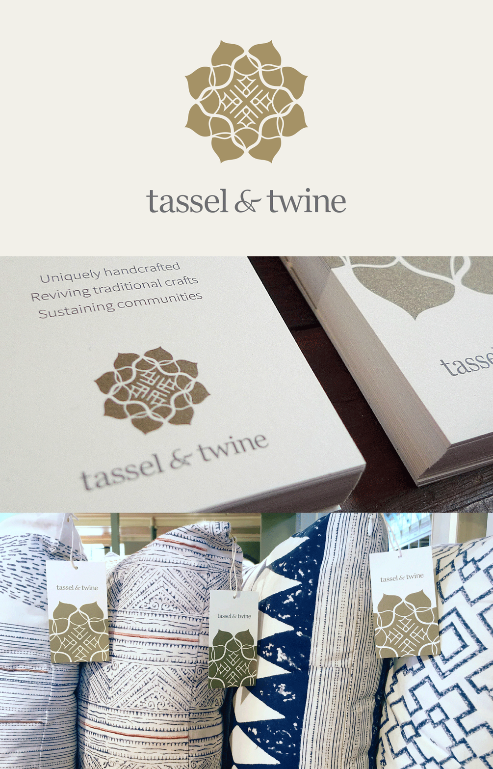
Tassel & Twine / a sustainable homewares brand with products made and designed with artisans in India. The brand symbol uses a the idea of a traditional mandala with the core principles of the brand incorporated - handcrafted, collaboration & helping communities. View the full case study here
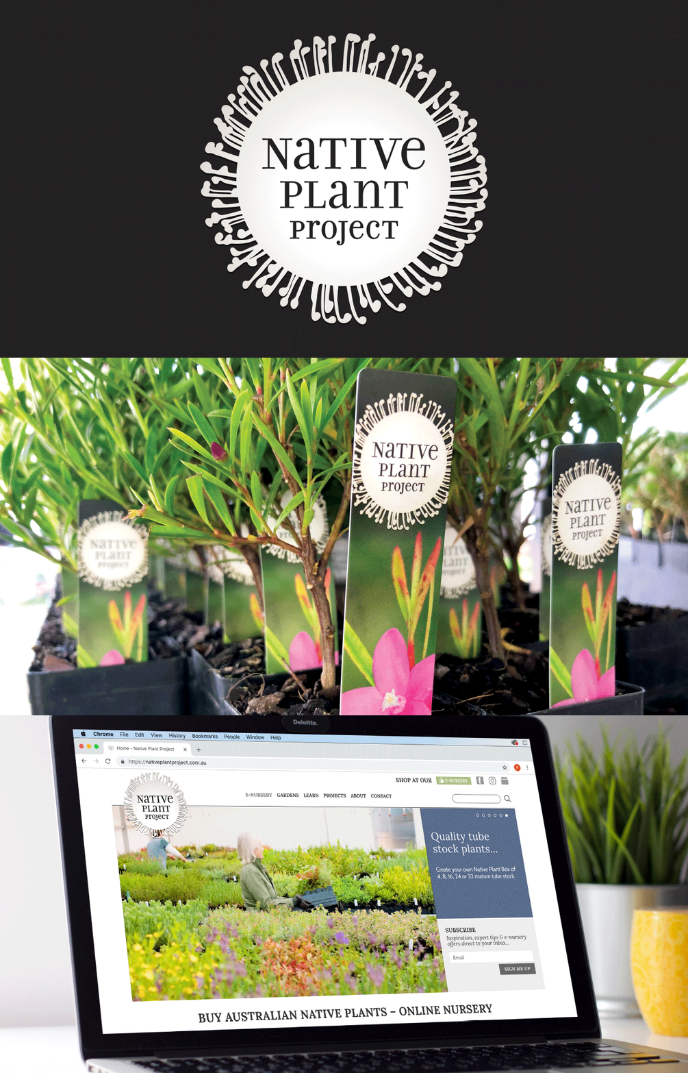
Native Plant Project / brand identity, packaging and Melbourne International Flower & Garden Show collateral for an online Australian native plant retailer. View the full case study here
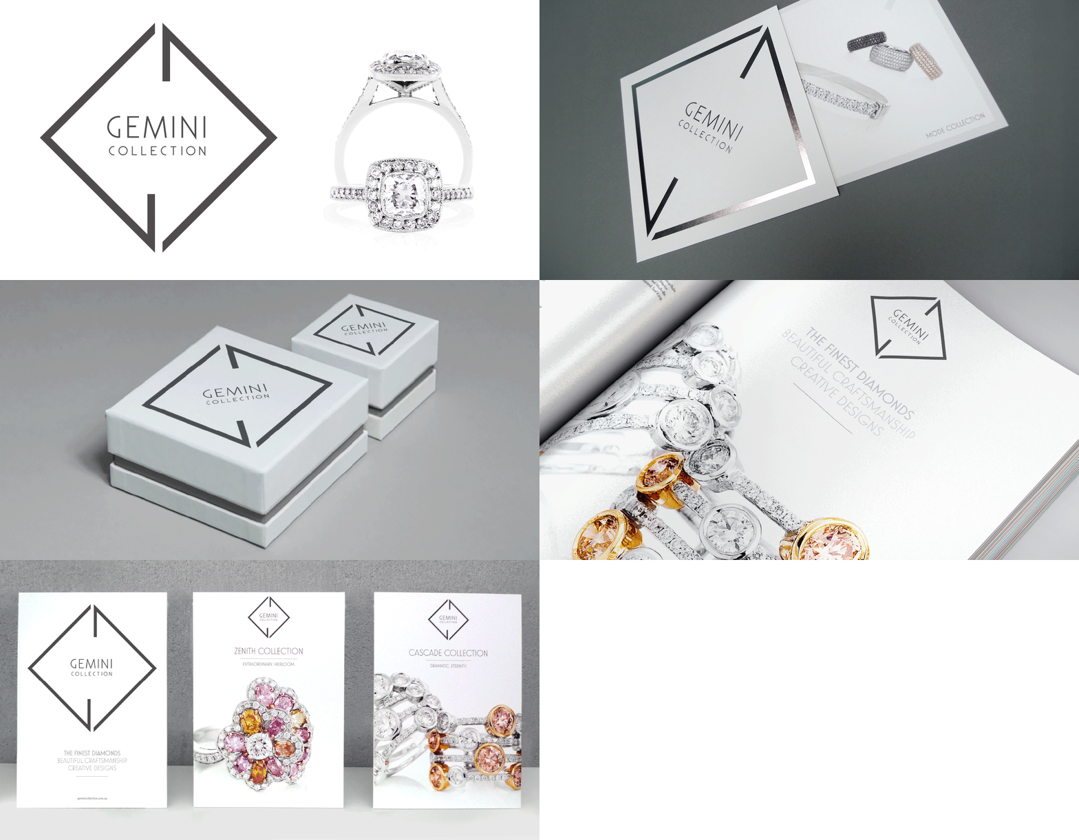
Gemini Collection / brand identity, packaging, website, and luxe collateral for a high-end diamond jewellery brand, featuring an Art Deco-inspired G&C monogram and dark platinum foil details.
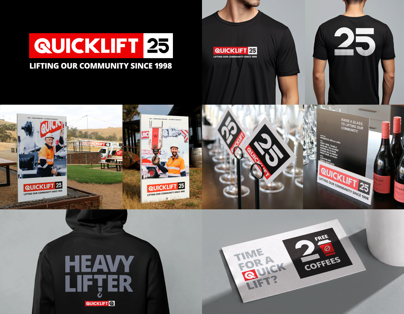
Quicklift Cranes / To mark Quicklift's 25 years in business, a logotype and strategic tagline: ‘Lifting our community since 1998’ was developed. Built from the guidelines we created, the strong, typographically-led look features heavily across the campaign, event branding, large site posters, apparel, and promotional collateral—celebrating their people and local connection.
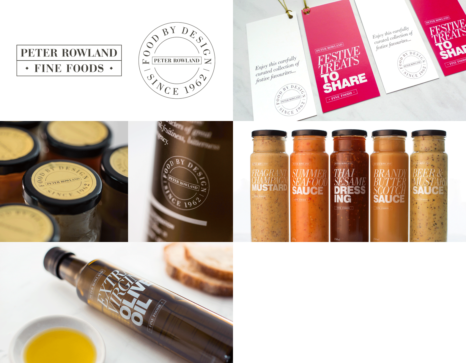
Peter Rowland Fine Foods / created for Melbourne’s premier caterer, the Fine Foods range extends the existing PR brandmark and adds a custom 'Food by Design' seal to celebrate 50+ years in business. Expressive typography and clear labels are used across the festive food packaging, with one of the hero items being a signature olive oil collaboration with Mount Zero Olives.
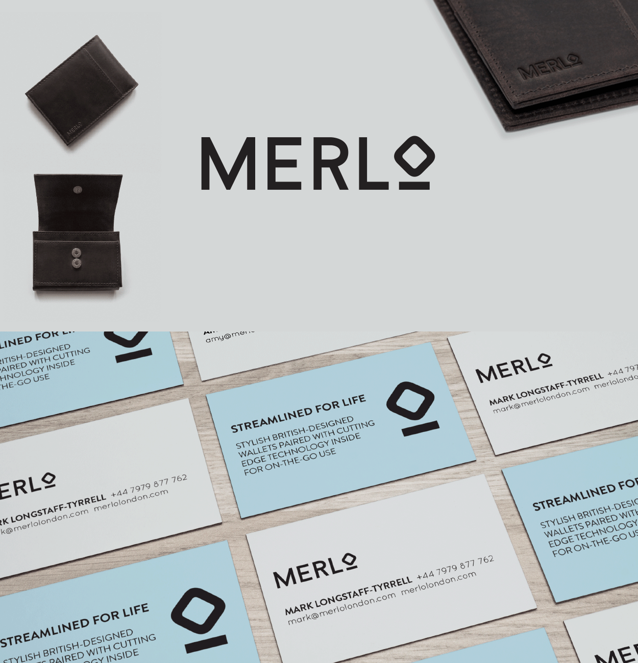
Merlo / logo for a stylish British-designed wallet range. The wallets are paired with cutting edge technology inside for use with contactless card payments. The 'O' gives a graphic impression of the wallet & a scanner.
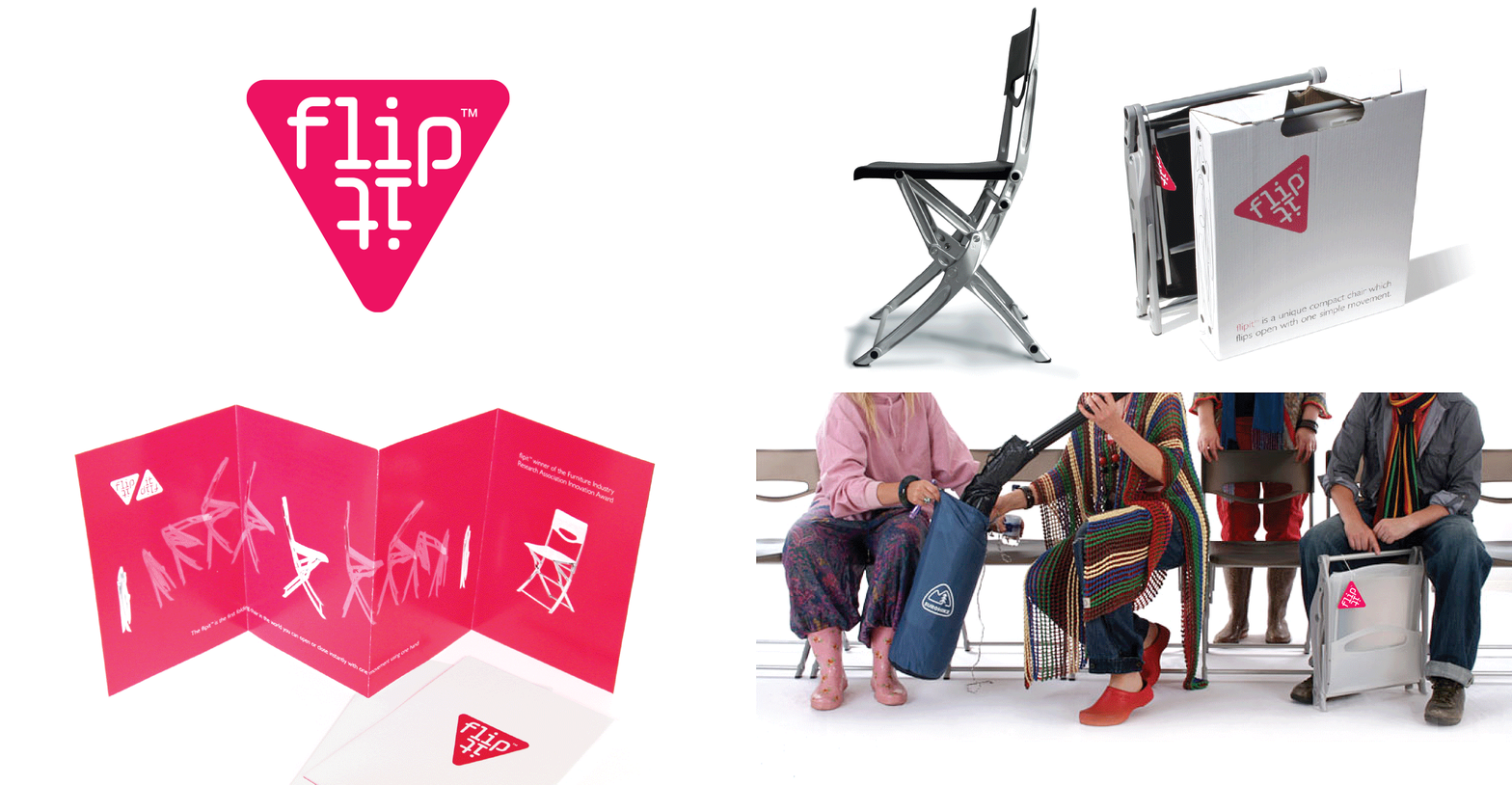
Flipit / the first folding chair in the world you can open or close instantly with one movement using one hand. Completed while working at Direct Design.
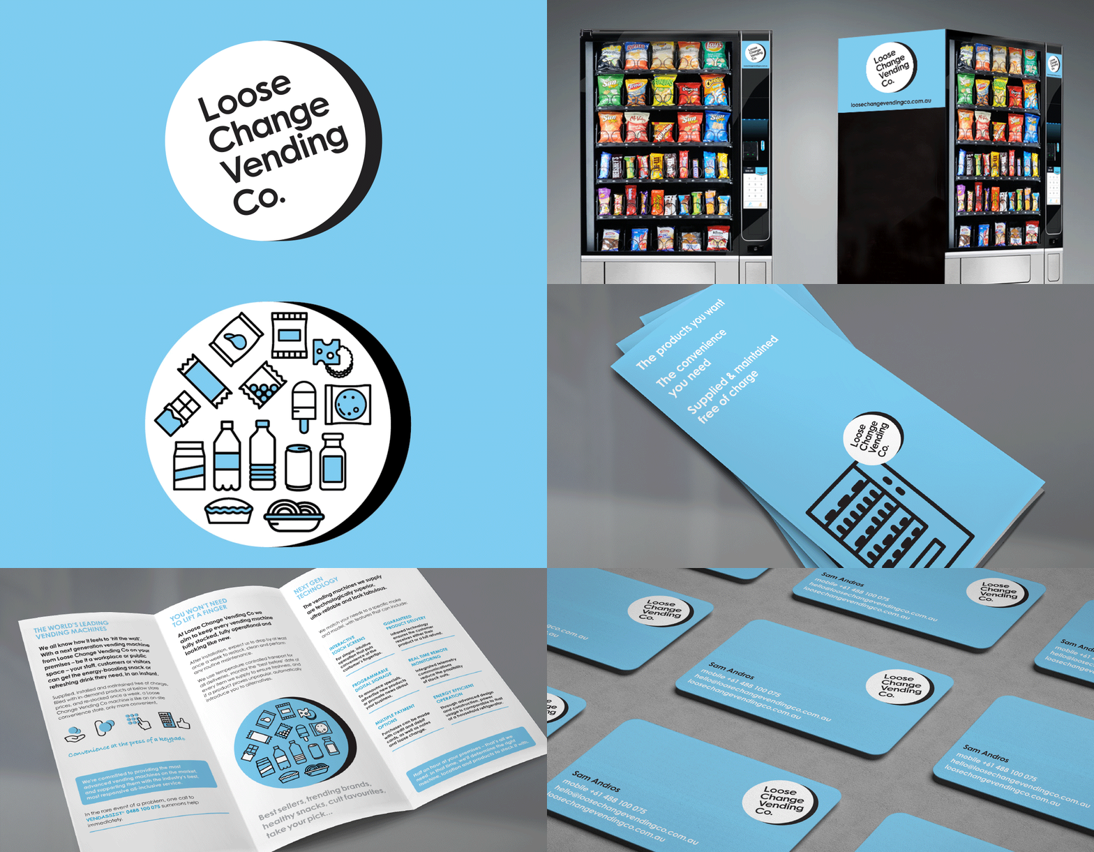
Loose Change Vending Co / reliable, quality vending machines, service promise and convenient offer were forefront to the visually and tonally friendly brand identity.
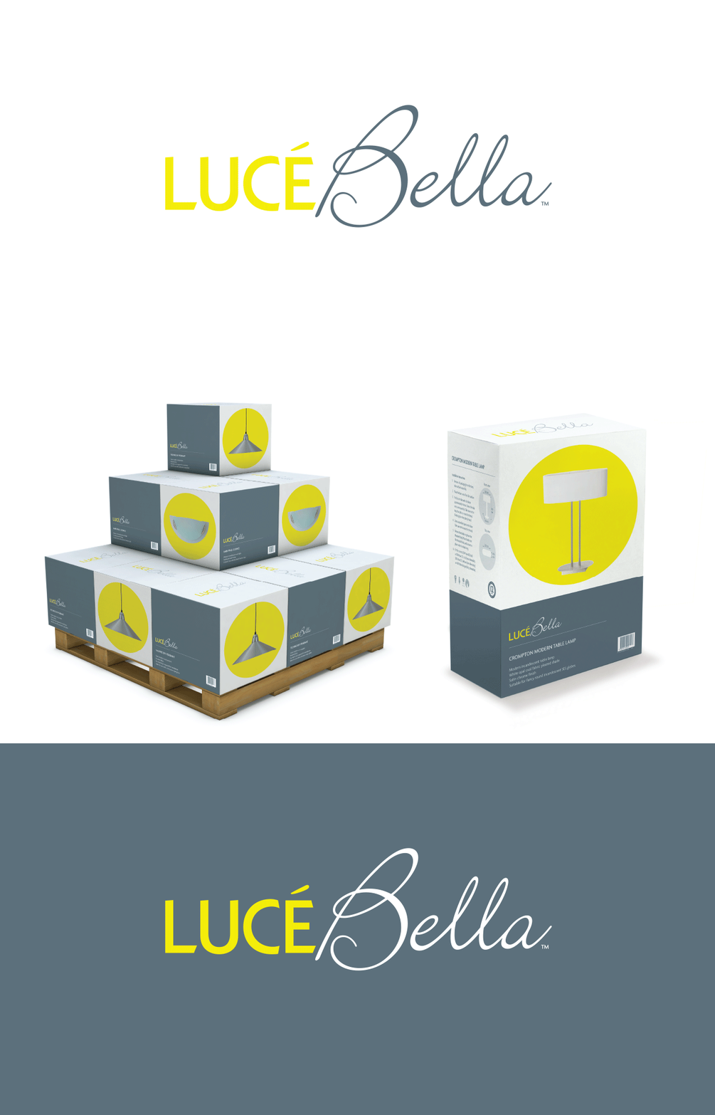
Lucé Bella / a European feel for an in-house lighting range which means ‘beautiful light’ in Italian. Completed while working at R-Co.
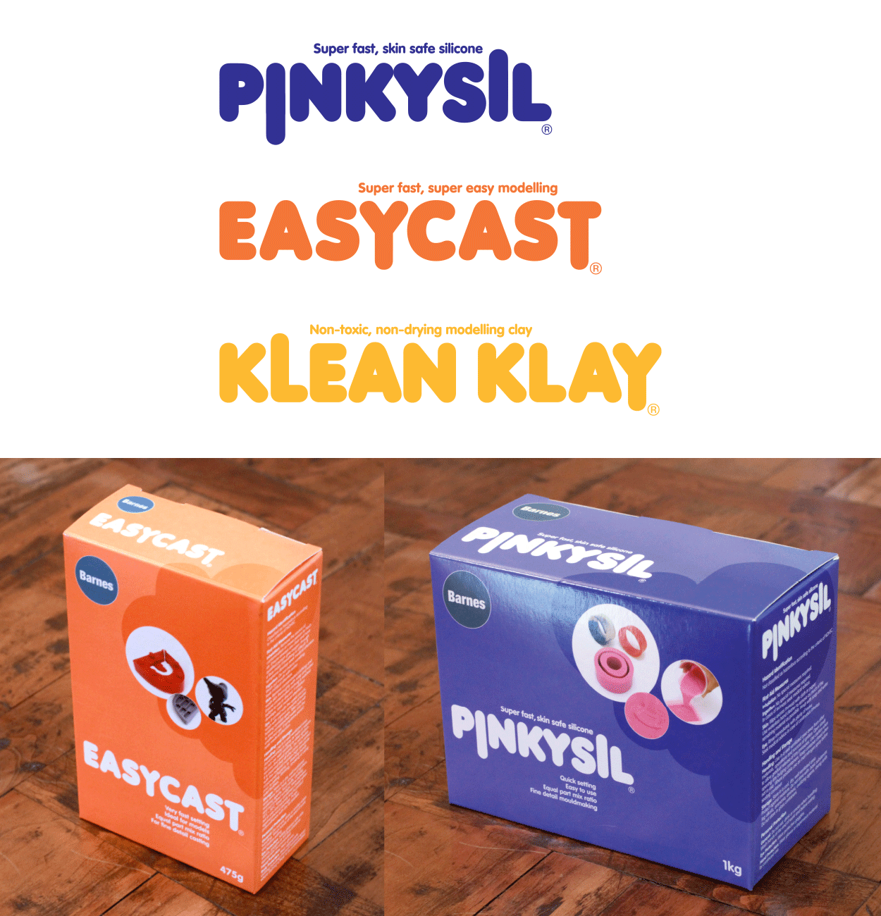
Barnes / sculpt it, cast it, mould it, finish it – a range of graphic logotypes and packaging for a supplier of materials for jewellery, model making and creative projects